Showing posts with label Portraiture. Show all posts

Sunday, 19 February 2017

Portraiture Work Diary

Portraiture Work Diary

Evaluation

I took some images of several different people to represent portraiture. We were given different photographers to base our photography around and I took images in a studio as well as picking different locations to take them in.


I took this image to represent the photographer Thomas Ruff because he takes serious images of different people to express them. I think this is one of my better pictures because it imitates a photographer well but has my own interpretation of the style of photography. Thomas Ruff's images are dull and slightly boring, however my image contains colour which makes us take a second look at the image as the colour is attractive to the eye. The colour of the background was linked with the girl because stereotypical girls like pink. A pink background makes her stand out because she is wearing white.


I took this image because I was experimenting with the settings on the camera. Trying out different locations helped test out the camera settings because we had to get the right settings to allow the right amount of light in. Personally, this is one of my better pictures because I like how the light in the picture is coming through the trees almost making her look like an angel. Although this is supposed to be a portraiture image I think the depth of field in this image adds effect to the image because we can see deep into the forest but we are still instantly drawn to her because the light is hitting her. I also like how the foreground is lighter than the background in this image.


Whilst experimenting with the different camera setting and locations to get a good picture there were some image that didn't turn out well. I think this image is included in the ones that didn't turn out well because the composition of the picture could've been put together better. The lighting is coming in at an awkward angle which exposes the bottom half of her at an angle which I don't particularly like. The natural lighting is also too bright so it didn't turn out as I expected.

Progression
To progress these images I put them into Photoshop and edited them to look better. 


To edit this image I increased the saturation of the image which made the colours of the leaves stand out more. I also increased the brightness of the image and darkened the shadows that are present in the image. Generally, this has made the foreground of the image stand out more because they appear slightly darker than the original image. The light coming through the trees also stands out more because we can see it clearly reflecting on her hood. The edited picture appears better than the original image because the depth of field appears more clearly and so does the girl.


To edit this image I made the background black and white to make her stand out more as she is the main focus of the image. I also increased the saturation of the girl which made her hair and skirt stand out more too. I think the edited image is better than the original image because the girl stands out more and when taking portraiture images you want the person to stand out more rather than the location they are in. The background being black and white helps draw attention to the girl because it takes away the slight depth of field the background has.


To edit this image I made it black and white to make all the colours blend into one. By making it black and white it makes us focus on her more rather than the colours around her. It links to Thomas Ruff's portraiture images more because they are every dull and boring so by taking away all the colours from this relates it more to his work. I think either image looks good because the first one is more attractive to the eye because it has more colour but the first one focuses more on the girl.


To edit this image I decreased the contrast of the image to reduce the colours in the image which gives a better effect to the image. I didn't like the yellow lighting in the original image so I wanted to reduce the yellowness in the image which I did by decreasing the contrast. I also darkened the shadows in the image which made his t-shirt black and make the shadow behind him darker which makes him stand out more.


To edit this image I made it black and white because I didn't like the colour of the lighting in the picture. I also cropped the image slightly to focus in more on the top part of the body. The edited image could be changed slightly by making her face a different shade of black/white because it is quite dark. If there was shadows in the image I would've darkened them because she would've stood out more. 


Thursday, 5 January 2017

Annie Leibovitz

Annie Leibovitz

She was born on October 2, 1949. She is the first woman to have held an exhibition at London’s National Portrait Gallery. Leibovitz is much influenced by Richard Avedon. She began taking photos when her and her family moved around with her father who was in the U.S Air Force. She began working for the Rolling Stones magazine where people we attracted to her famous portraits of celebrities. 

Photography


In this image we can see Meryl Streep, she has white face paint on her face and she is pulling it in different directions. This image is a very plain image and there isn't much colour in it. The deeper meaning of this image can link to Meryl Streep and the fact that she is an actress. She has played many characters, the fact that she is pulling her face around can show this is how she feels when she has to go from character to character. Also, Leibovitz may be trying to show the actress in a different light rather than the make-up that we would normally see her with. This image is showing us that although we see these types of people with nice hair and make-up, this isn't what they look like all the time. It shows that young girls shouldn't inspire to be these people just because they look nice.


In this image we can see a little girl with blue eyes and dirt on her face, the wind is blowing her hair in her face. We recognise this image from the film les misérables. Looking at this image and not thinking of the film we see a little girl that look homeless because of the dirt on her face. The colour blue represents loyalty, wisdom, strength and trust. The fact that her eyes are blue shows us that although she may be homeless and have nothing she still has hope in her eyes and in her mind. The deeper meaning of this image can show that although you have nothing, if you hope and dream you might make it.


In this black and white image we can see Adele with her hair blowing in the wind. Unlink her image of Meryl Streep, Annie Leibovitz has made this image of Adele look attractive. In my opinion, she has made Adele look attractive because the media didn't display Adele as an attractive figure before 2016. The picture appears black and white to link with Adele's music. Her music is deep and sad which goes well with the colourless picture Leibovitz has produced. 

Wednesday, 4 January 2017

Portraiture Straight Images


I took this image on the black and white setting on my camera because I think it created a better effect than if I was to take it on the normal setting. This picture has a lot of tones because we can see the shadow that is represented on the wall behind her and the fact that half of her face is almost in darkness. I think her mood is represented by her face and the dullness because it seems like an unhappy image as we can tell how she is feeling. I could've taken this image in colour instead of black and white but I wanted to express the feelings more than a normal photo.


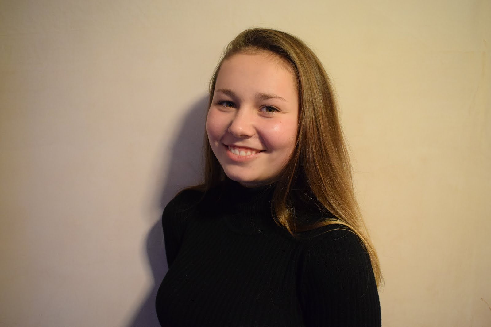
I like this photo that I took because I think the lighting represents the feeling in the picture. The fact that the lighting is bright makes the mood more happier and because she is smiling we can understand her mood better. I also like the contrasting of colour in this picture where she is wearing a black top but everything else is in colour as it makes her face and feeling stand out rather than what she is wearing. I could edit this by making it black and white but I think I am just going to increase the brightness and saturation because I want to keep the mood the same.


In this picture the girl stands out because of the colours she is wearing. The fact that she is wearing white means that she stands out against the greens and the browns of the forest behind her. I like how the sunlight is shining through the tress and onto her, the light almost represents a spotlight pointing in her direction to make her stand out even more. Although the background is blurry there is still a great depth of field because we can see the trees in the distance. I think it helps that the background is blurry because it helps her stand out more as she is the main focus in the image.


This picture was taken in a studio with lighting and a background. The fact that there is a pink background links to the fact that she is a female, the brighter colours gives the set up a feminine touch as if it was a male in the picture we would've seen darker, less vibrant colours. This picture appears better with colours because we can see the details in her face. Also, the background helps her stand out because the white stands out against the pink along with her hair and face. 


I like this picture because there is a lot going on in the background but we still manage to focus on her as she is the main focus of the image. The fact that the background is blurry also helps us focus on the girl more as we are not distracted by things going on in the background. I think the colours she is wearing also helps her stand out because she is present on a background where the colours she is wearing are virtually non-existent. I think I am going to crop this image in further because it will help focus on her more.

Portraiture Contact Sheet


Monday, 28 November 2016

Portraiture Image Bank


In this image there isn't much going on, it is just a normal portraiture photograph but I like this image. The lighting in this image is very feminine and soft, this lighting helps define her features, for example her cheekbones are darkened to create more shape to her face and make her make-up stand out more. Also, the background in this image gives a good effect because the dark colours make her stand out more rather than having a white background which would create a lighter version of the image giving it a different message. I like how she has no expression on her face giving the image no real emotion, all we have to go by is the dark colours which make the image seem dark. The main focus in this image is her lips because it is the only bright image existent in the photo and it stands out agains the other colours. I can use ideas from this image in my work by taking pictures of people using different colours to produce images with different emotions.


This image has a strong meaning that can be perceived in different ways. Some people may see him painting on the colour but other people may see him painting on the black and white effect. I think this image has a racial view behind it because it may seem as though he isn't comfortable in his own skin and that he wants to get rid of his colour so he can fit in with the society around him where he is mocked for the colour of his skin. The expression on his face also adds to this effect because he is straight faced but almost looking sad instead of angry. As well as his expression the lighting also adds a great effect too because it is dull and dark which represent his feeling towards the people and the society he is living in. I can use ideas from this image in my work because I can use photoshop to increase the effect that I am trying to portray in my images.


I chose this image because I think it has a great meaning about make-up. The fact that she has different colours smeared around her face represents to us that the photographer may have a negative view on make-up. They could be trying to portray the fact that make-up doesn't make us look good it is just different colours covering us up. I can use ideas like this in my work by creating images with strong meanings that people can relate to and look deeper into.


I chose this image because I think it has great tones. There are no colours in the image which makes the detail stand out more. I think this image has better meaning without colours because this way we can se the tones that are displayed, for example her cheekbones are highlighted with a dark tone to show feminine features. I can take ideas from this photographer by creating great detail but having the images black and white to create better tones.


I chose this image because the fact that it is an image of a celebrity it draws our attention more. I like how this also has no colours in the image because it makes the tones stand out more. More feminine lighting has been used in this image because of the areas of her face that appear lighter. The fact that the photographer is showing a celebrity makes us read more into it as we know her life and what kind of person she is. I can use ideas like this in my work by representing people's moods in the pictures.

Portraiture Definition


Portraiture 
A portrait is a painting, photograph, sculpture, or other artistic representation of a person, in which the face and its expression is predominant. The intent is to display the likeness, personality, and even the mood of the person.
I chose this image because I like how the lighting is dark and very masculine. The dark colours give a very masculine vibe and the fact that it is a picture of a man adds to the effect. I also like how the image is in black and white because it helps with the tones in the image. This image also has good tones because his features are made clearer by the darker and lighter tones, for example his beard has a shadow against it which makes it stand out more. His facial expression also adds to the effect because his stern look makes him seem more threatening which corresponds with the lighting and the tones.


The way this portrait has been taken meets our standards of a political war hero because he looks strong because of the way he is standing, it makes him look like a dominant figure. He is showing a serious demeanour and the lighting adds to this serious effect because it is a dark. The image appears dark and serious which is the feelings that most of us share about war, the fact that he was a political war hero helps us link the feelings portrayed in this image with the feeling we have about war. Although he is seen as a hero the image doesn't portray him as such a 'hero' because we would associate lighter and happier images to make the person look inviting but this is not portrayed here at all.


When we look at this photo we are instantly attracted to the different colours and patterns being portrayed in the image. The make up also stands out to us because it is a very extreme make-up look which we would associate with models and magazines. Researching further into this image we find out that this woman is Amanda Lepore, a transgender model. Instantly we understand why the colours are so bright and stand out from other magazine shoots or front covers that we see regularly. I think that the colours are there to show us that she shows her true personality and who she really is even though some people may have different opinions of it. The colours in the image relate to the LGBT community because their symbol is the rainbow and she displays a very colourful image here.