Showing posts with label Straight Images. Show all posts

Sunday, 8 January 2017

Photoshoot 1 Straight Images


I took this image because I liked how the lights stand out against the darker colours. Also, I like how we are not just looking at the hotel as there are trees included in the shot which adds effect to the image. I was interested in taking this image because the hotel is situated on a corner rather than straight on a road, the fact that it is on a corner gives the image a lot of depth of field because we can see deep down the left side of the hotel. I think this represents the topic of London well because when we walk around there are several different hotels that all look different.


I took this image because I liked how the tunnel appears as dull and dark but the graffiti around the outside brings it to life more. This graffiti tunnel is located in the nicer areas of London which confuses us because we don't relate these sort of scenes in posher and upper class places. I was interested in taking this image because it straight away took my attention because of the bright colours. Also, I like how this can be perceived as a deserted area because of the greenery hanging down and the lack of cleanliness. I think it represents London well because it shows the areas that people might not think of straight away.


I took this image because I wanted to capture Big Ben but in a different way to the stereotypical pictures of it alongside the Houses of Parliament. I was interested in taking this image because I wanted to incorporate other buildings and the road as well as Big Ben. Although there is a lot going on in this image the main focus of Big Ben is still visible and clear. I think this represents London well because it shows a main landmark and what is happening around it on a normal day. 


I took this image because I wanted to capture the importance that this building showed and how it stands out against everything else. Although this building is not famous at all and is just a hotel I was interested in how it is made to look important and stands out against all the traffic which is passing by. The fact that this is a hotel shows us that hotels in London are made to stand out and have some importance because everyone looks different and is different.


I took this image because I wanted to capture the importance of the Big Ben. I think it helps in this instance that some of the Houses of Parliament is existent in this image because it makes Big Ben stand out more as it dominates over the building. I think the colour of the sky adds effect to the image, the fact that is is dull makes the buildings stand out. I think this represents London well because it is a famous landmark and it stands out as it is well known.

Wednesday, 4 January 2017

Portraiture Straight Images


I took this image on the black and white setting on my camera because I think it created a better effect than if I was to take it on the normal setting. This picture has a lot of tones because we can see the shadow that is represented on the wall behind her and the fact that half of her face is almost in darkness. I think her mood is represented by her face and the dullness because it seems like an unhappy image as we can tell how she is feeling. I could've taken this image in colour instead of black and white but I wanted to express the feelings more than a normal photo.


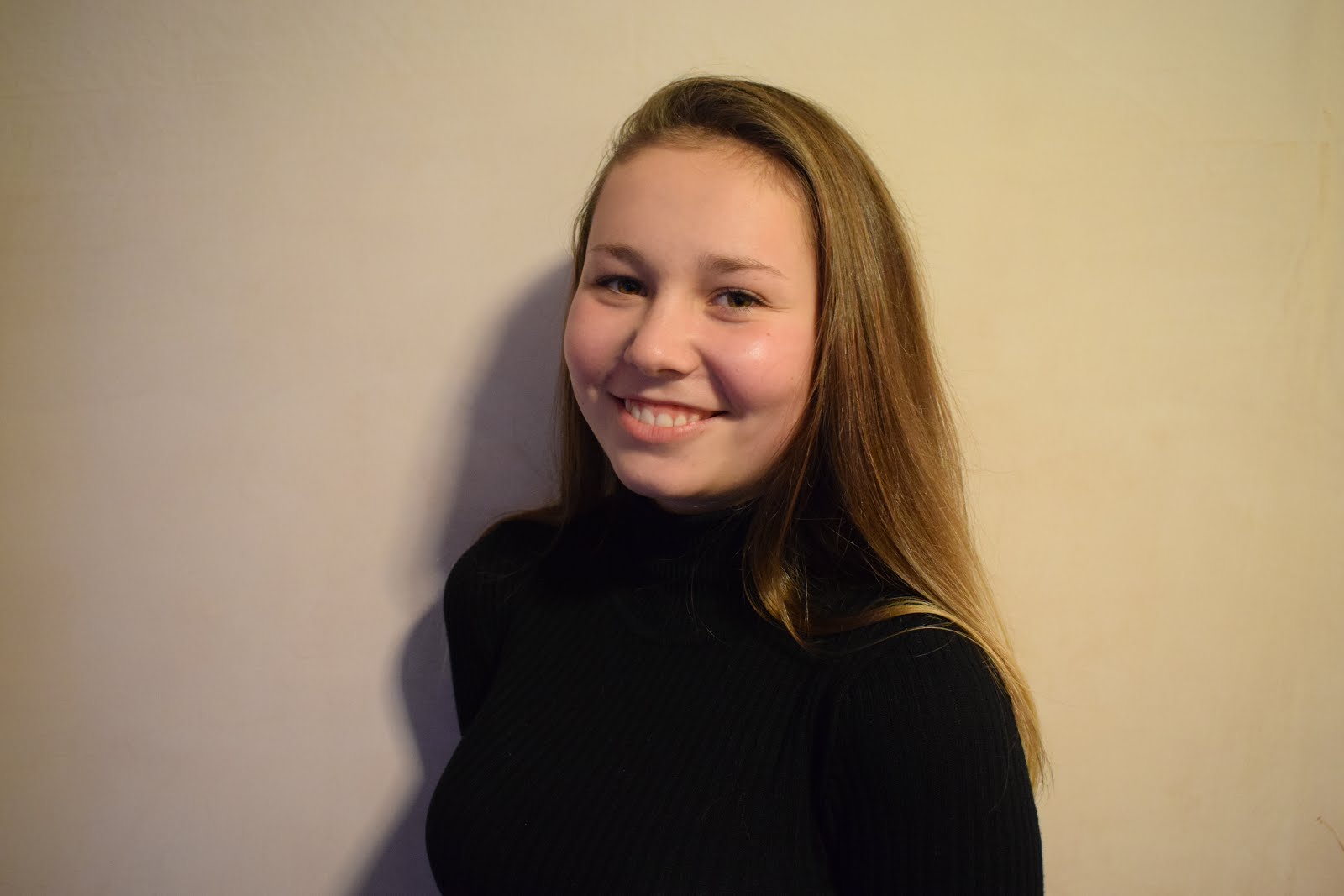
I like this photo that I took because I think the lighting represents the feeling in the picture. The fact that the lighting is bright makes the mood more happier and because she is smiling we can understand her mood better. I also like the contrasting of colour in this picture where she is wearing a black top but everything else is in colour as it makes her face and feeling stand out rather than what she is wearing. I could edit this by making it black and white but I think I am just going to increase the brightness and saturation because I want to keep the mood the same.


In this picture the girl stands out because of the colours she is wearing. The fact that she is wearing white means that she stands out against the greens and the browns of the forest behind her. I like how the sunlight is shining through the tress and onto her, the light almost represents a spotlight pointing in her direction to make her stand out even more. Although the background is blurry there is still a great depth of field because we can see the trees in the distance. I think it helps that the background is blurry because it helps her stand out more as she is the main focus in the image.


This picture was taken in a studio with lighting and a background. The fact that there is a pink background links to the fact that she is a female, the brighter colours gives the set up a feminine touch as if it was a male in the picture we would've seen darker, less vibrant colours. This picture appears better with colours because we can see the details in her face. Also, the background helps her stand out because the white stands out against the pink along with her hair and face. 


I like this picture because there is a lot going on in the background but we still manage to focus on her as she is the main focus of the image. The fact that the background is blurry also helps us focus on the girl more as we are not distracted by things going on in the background. I think the colours she is wearing also helps her stand out because she is present on a background where the colours she is wearing are virtually non-existent. I think I am going to crop this image in further because it will help focus on her more.

Monday, 5 December 2016

Landscape Straight Images


I chose to take this image because I think that it shows landscape well. I like the effect that the leaves make because it shows us the time of the year. The darkness displayed in the image also helps us work out the time of the year too because it is quite dark which helps us know that it is during autumn or winter, if it was during the summer we may have gotten the glare of the sun reflecting off of the sign. I like how this can be displayed as an urban area because it relates to the London underground. Also the train and the train track in the background also helps add to the effect because as well as looking at the station sign we are also drawn to things happening in the background.


I chose to take this image because I think it shows landscape really well. I like how this can be related to the rule of thirds because it is separated into three sections, the grass/ground, the forest/trees and then the sky. The sky helps the colours in the photo stand out more because it is white/grey so the colours appear brighter against it. If the sky was blue it wouldn't have the same effect as the grey sky does. The image also has an eerie effect because although the trees look colourful they also appear dark and not very inviting. Also, the sky is dull which also adds to the eerie effect. 


I chose to take this image because it shows landscape well as there is a great depth of field present in this image. I like how this image hasn't been taken straight on because by having it taken at a angle we are able to compare it to the small part of the outside we can see. This image has a horror effect to it because the end of the path our eyes follow is incredibly dark and creepy. I think the glare on the floor also adds to the horror/eerie effect because it suddenly stops and goes completely black. Also, I like that although the light from outside is present it doesn't light up the whole of the inside, this adds to the eerie effect because only some light is showing.


I chose to take this image because it shows landscape well as there is a great depth of field in the image. I like how their is a main focus on a few trees that are in the foreground but the background also interests us as it shows deep into the forest. Also, I like how the sky is light but because the photo has been taken in a forest it is dark inside making the image look eerie. Although the trees have virtually no leaves on them the picture still looks full and there are many things that take our attention. 


I chose to take this image because it shows landscape well as there is a great depth of field in the image as we can see far into the distance. The fact that everything in the background is blurred gives the image a better effect because we are drawn to it as we look at all the different lights there are. I like this image because it is very eerie and relates to horror because it is dark and the only lighter parts are in the foreground of the image.

Thursday, 10 November 2016

Movement Straight Images


I took this image of a roundabout because I wanted to capture the fast movement of the roundabout. This image works well with a motion blur rather than a freeze frame because the freeze frame wouldn't have captured the movement as well as a motion blur. In the image we can see the movement well because the bars of the roundabout are not in focus and these are the main things that are moving. I think the fact that the rest of the image is in focus adds great effect because we are instantly drawn to the motion blur. Also, the way that the bars nearer the camera have a greater motion blur than the bars further away gives a greater effect than if the whole thing was just a massive blur. 


I took this image of swings because I wanted to capture the movement of both the swings going at different speeds. This image shows a motion blur as well as a freeze frame. The swing nearer the camera can be seen as a weak motion blur and the swing behind shows a freeze frame. The fact that the closer swing is a motion blur helps us establish the fact that this swing is going faster than the other. I think swings work well with either motion blur or freeze frame because both types of photo show the movement of the swing well. By having the photo closer to the camera not in focus makes us focus on the swing further away because it stands out but we still manage to focus on the other swing too.


I took this image of someones feet whilst they were walking because I wanted to capture their movement. This image shows a strong motion blur because the back foot is almost non existent where as the front foot is more visible. The fact that the back foot is less visible makes us see it is it is fading away as it almost looks ghost like. The way the background is more in focus makes the motion blur stand out more. By showing only the persons feet rather than their whole body makes the picture more interesting because we only focus on the feet whereas if their whole body was in shot it is likely that other aspects of the image would draw away our attention. 


I took this image of a taxi because I wanted to capture the movement of traffic as it went past. This image shows a strong motion blur because the taxi is totally a blur. Motion blur or freeze frame would work well in this case but I chose motion blur as it looked better against a focussed background. Having the background in focus helps the motion blur to stand out because it is the only blurry part of the picture. I think this motion blur is good I don't think it needs increasing or decreasing because it already gives a good effect.


I took this image of a girl because I wanted to capture the movement of her swaying her hair back and forth. This image shows a motion blur because the movement of her hair has created a blur. I think a freeze frame or a motion blur would've worked in this case but I chose a motion blur because it stands out more against the focussed background. I think the fact that everything else is in focus apart from her hair makes us focus more on the hair and what sort of movement she is performing to get the motion blur.

Saturday, 5 November 2016

Reflection and Framing Straight Images

Reflection

I took this image because I think it showed reflection well because you can see his reflection in the mirror. I think this is a good image because we can see the reflection clearly. In this image I focussed in on the reflection rather than him. I think it was better to show him looking at himself in the image because it gives a better effect to the image. The angle of the picture is good because we can see him and his reflection well. This picture has good meaning because we can interpret from the image that he is looking at his reflection for several different reasons.


I took this image because I think it shows reflection well because we can see her and her reflection but it has been blurred. By blurring the reflection I think it gives a greater meaning that if we didn't blur it. I focussed on her rather than the reflection because it could show that she doesn't know who she is anymore, it gives it a deeper meaning. I think the angle of this image is good because we can see the full reflection and her but it is blurred, the angle helps the blur. 


I took this image because I think it shows reflection well because we can see the reflection in the mirror. I think this image is good because we wouldn't normally take images in these sorts of mirrors but it worked well. I think the fact that the trees surround the mirror makes us focus in more on the mirror because we are not attracted to the outside of the mirror. Also I think that the red and white stripes around the mirror make it more bolder and more attracting to the eye because we are drawn into looking in the mirror. 


I took this image because we can see his reflection in the mirror well. I think this image has a good deep meaning because he is doing his hair and looking into the mirror which could reflect vanity. The focus on the image worked well because we are only drawn to his reflection as it is the only part that is in focus. Also, the focus of the image helps add to the meaning because we can say that he is only drawn to his own reflection and nothing else.


I took this image because I was drawn into the reflection of the statue onto the water. I think this image represents reflection well because we can see the reflection of the statue on the water well. The ripples of the water add to the sense of surrealism because the reflection isn't an exact copy of the statue as the ripples have distorted it. I think the angle of this image is good because we can see the reflection well. 

Framing

I took this image because it shows frame well. The way that the trees are in focus and the window markings aren't show frame well because we are able to just focus on the trees through the window. I think the fact that the trees are in the distance but they are in focus gives the image a deeper meaning as the foreground of the image is not in focus. I think this image turned out well because it shows frame well because we are focused what is inside the shape.


I took this image because I think it shows frame well because we are drawn in to looking through the shape of the hands. I think this image works well because the hands reflect the shape of the tree. The fact that the background is in focus helps relate to frame because we are only drawn to looking at what we can see in focus. Also the fact that the hands are not in focus helps relate to frame too because we know that this is the unimportant part of the image.


I took this image because it relates to frame as we focus on the clouds rather than anything else because nothing else is in focus. This relates to frame because we only care about what it inside the shape being made by the hands. I like this image because it has a deep meaning which is added to by the focus of the image, by making the hands not in focus helps as we only care about the clouds. The shape helps to add effect because we can see a lot through the shape and it is big enough to help us focus on what is behind the shape.


I took this image because although it shows reflection it also shows frame. The way that we are only drawn into the mirror adds to the frame because we are drawn to what is inside the shape. The fact that the rest of the image isn't in focus helps add to the frame effect because we only focus on the the focussed parts of the image. I think this is a good image because the area that the frame is in stands out. 


I took this image because I think this shows frame well as we can see through the gap a tree and it is the only thing in focus in the image. I think this image works frame really well because we only see a part of the landscape but the part we see draws us in and makes us want to see more. This picture turned out well because the focus of the image shows frame as the foreground isn't in focus but the background is in focus as this is the bit we only want to see. The fact that the fence acting as a frame is dull and boring makes the tree stand out more.

Sunday, 30 October 2016

Shape Straight Images


I took this image because I think that it represents shape well. In this image there are several different shapes the main one being the clock face, the numbers also count as shapes along with the hands of the clock. I like this image because it doesn't show the clock face on it shows it at a different angle. The focus of this image has also worked well because the top end of the image is more in focus than the bottom of the image, this creates a better effect than if the whole image was in focus.


I took this image because of the several shapes included in it. The circles of the powders show shape but also the several different circles incorporated in the powders. I like this image because the focus of the image works well as the whole image is in focus. The angle of this image is also good because if I was any closer all the powders wouldn't of been seen and if I used a wider angle then other things would've appeared in the image. 


I took this image because it includes more than one shape, the bagel itself counts as a shape but the ring inside also counts as a shape. I like this image because it looks like it has been taken in a studio but it hasn't. The flash of the camera helped get such a clear image. I like that the image is so clear and it doesn't include anything else in the image. The focus of the image has helped here because if this image wasn't in focus it wouldn't have had such a big effect. Although this object isn't 2D the direct light hitting it makes no shadows so it doesn't look 3D.


I took this image because the watch faces showed shape. I like this image because the watches together have a big effect because they are both different but the same features on them show shape. The light hitting the objects create a big effect too because it brightens the face which helps it become clearer so we can establish the shape.  I think this image could've been zoomed in more slightly because the actual watch faces are not clear enough.


I took this image because the apple sign is 2D so it shows shape. I like this image because you can play around with it a lot in Photoshop when I come to editing my pictures. I think the lighting in this image could've been improved because it is a bit too dark, if the image was lighter I think that it could be a better picture. I also could've incorporated more in this image that relates to shape such as several other apple products showing their logo.

Tuesday, 25 October 2016

Tone Straight Images


In this image I used lighting from all angles to produce light all over. This creates a welcoming tone because the lighting is bright and doesn't create any darkness in the picture. I think this lighting is very feminine because it lights all areas of the face unlike masculine light which darkens some areas. I think the lighting in this image is the  main feature because if it was darker it wouldn't create the same effect. 


In this image the natural light creates tones. The natural light creates a bright tone and is welcoming as there is no dull parts in the image. The natural light helps creating tone because if it was dark the tone would be different but because it is bright the sky looks bolder. In this image the main focus is the sky because the houses underneath are slightly duller than the sky.


I used harsh lighting in this image by placing a light at the left side to create the contrast of light to dark. This doesn't create a welcoming tone because the lighting is very intimidating, if this was person it would make you not want to go near that person. The controller also has tones because the camo effect has light and dark tones. The angle of the photo also has created tone because the way the camera is positioned helps us see the shadow that is created.

I also used harsh lighting in this image too. From the image we can see that the lighting is coming from the right hand side because the right side of her face is lit and the left side is darker. The harsh lighting is very masculine because it focuses on one part of the face whereas if I used feminine lighting it would light all areas of the face. This image shows dark tones because of the black colours, the dark colours make her face stand out more. Also, the fact that the camera angle is not zoomed in gives a better effect, the darker side of the face is more visible when the camera is further away.


I used natural lighting for this image. The natural light creates a shadow behind each of these objects. The bright colours in the image change the look of this picture because if it was dull or black and white the picture wouldn't be as intriguing. From the image we can tell that the light is coming from the right hand side because the shadows that are being produced are laying towards the left side. Although this is natural lighting it it still harsh lighting because only certain areas are lit and the other areas are darker.

Sunday, 9 October 2016

Form Straight Images


I took this image of my phone because it represents form well. The light reflecting on the phone is clear on the left hand side as we can see a line of light. This makes the image 3D because the light almost creates and illusion of the phone becoming 3D as it looks like the left hand side is flat. The shadow created at the bottom of the phone also helps the form of the object because it helps create the 3D effect. I think this image needs to be sharpened and edited to improve it further and make it a better image.


I took this image of a pair of glasses because they represent form. With the light reflecting onto the glasses shadow is created around the glasses to increase the 3D effect. The white background helps with the form because the shadows from the light appear darker to create the 3D effect. I think with some editing in Photoshop this image could turn out better. I think I need to increase the brightness to make the picture seem less dull and more alive but keep the shadows as dark as possible.


I took this image of a water bottle because it represented form well. The shape of the bottle is what attracted me to take pictures of this because I wanted to capture the edges well. I think the fact that there was water in the bottle helped create form because the bottle is heavier and the water helps create form whereas if the bottle was empty it would be obvious, this shows that water helps the form of the bottle become less or more. I think editing this photo by making it sharper and the background black and white this will improve the image.


I took this image of a plant because it represented form well. The leaves of this plant are really visible in this image which helps create form, also the black/darker layer around the leaves of the plant also make it more visible which helps with form. I think by editing this photo I could make it much better by making it black and white and sharpening it.


I took this image of the bus shelter because I thought it represented form really well. This image doesn't look as good but I like it and I think that with editing I can improve it a lot. The foundations of the shelter stood out to me because they were different shapes and created different forms. By brightening the picture I think I could improve it more because we will be able to see the image clearly.

Saturday, 1 October 2016

Texture Straight Images


I took this image of a cat because I wanted to focus right in on the fur as I wanted to see if I would be able to get very close that you would be able to see the texture of the fur. I think I have achieved this because not only can you establish the texture of the fur but you can also see the whiskers which can also show texture as the image shows them to be spiky. I like this image because I think it has turned out very well.


I took this image of a wall because I wanted to focus on the cracks in the walls to show that the wall is rough and not smooth. This image links to texture because we can see the unevenness of the wall and we can image what it would feel like. I think I have achieved the concept of texture in this image because the angle I have taken this image at enables us to see the cracks and the unevenness of the wall.


I took this image because it links to texture well as we are able to see the individual hairs of the jackets fur that helps us image what it would feel like. I like this image because it is an abstract image as when you first look at it it isn't noticeable straight away what the image is. I think I have achieved the concept of texture in this image because we can image that it would feel soft.


I took this image because I wanted to see if I could get the small fibres on it to stand out as it makes us think about what the object would feel like. I think that I have grasped the idea of texture in this image as the angle that the photo was taken at enables us to be able to see the small fibres and fur on the object which helps us imagine how it would feel.


I have taken this image because I wanted to focus on the bumps of the object. I think I have created the image well that you are able to see the texture of the object. We can tell that the object is bumpy by the way the bumps stand out. Also the angle that I have taken the image at helps because if i would've used another angle it might not have been as clear to see the bumps. I think that this is one of my best images because the texture of the object really stands out.