Showing posts with label Landscape. Show all posts

Tuesday, 31 January 2017

Landscape Work Diary

Landscape Work Diary

Evaluation

I think this is one of my better images as it has a great depth of field, we can see deep into the image as it is unclear when the path ends. Although the bushes aren't the main focus of the image we can still see them in great detail and they add great effect to the image. I think the path and bushes add a great effect to the image because this is naturally where our eyes follow. To edit this image I think I will make the sky lighter because I didn't want to create the darker tone that this image is showing, by making the image lighter it will have a better effect. 


This is also one of my better pictures as it too has a great depth of field because we can see far in the distance to behind the buildings and in the direction the traffic is going in. I think the fact that we can see where I was standing where I took this image increases the depth of field too because our eyes naturally follow the wall into the distance. This picture is very dull but it adds effect to the image because the small lights we can see on the cars and the traffic light stand out against the dull lighting. To edit this image I will make the image lighter as a whole and maybe crop the sky slightly as this isn't the main focus.


In my opinion, I don't think this was the best landscape image that I was able to take because it is quite dark and we can't see the car park very well. I like the way the sky looks in this image because the clouds are very low and clear. Instead of focusing on the real landscape this image really only focusses on the sky. To improve this image I could change the camera setting to allow in more light to make the car park seem brighter instead of really dark, if it wasn't so dark it would've been a good photo.

Progression


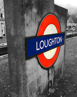
To edit this image I made everything other than the sign black and white. By doing this the main focus of the image stands out more. I think the edited version is better because we are drawn to the station sign rather than what is going on in the background. Making the image black and white also helps with taking away the effect of the leaves as the image appears better without them. Although the train in the background does add effect to the picture I decided it would look better black and white to draw more attention to the sign. As well as making it black and white I increased the saturation of the sing to make it stand out more and appear more vibrant.


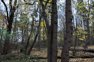
To edit this image I increased the exposure of the image which made it slightly brighter which helps increase the mood and prevent it from looking dark and dull. Also, I increased the saturation of the image which brightens the colour of the leaves on the trees and also brightens the colour of the sky. I think by doing this it has helped with the depth of field as we can see clearly into the back of the image. The edited image appears better because the colours are brighter and the image is less dull. Although the image looks good dull as it was in a forest which people would associate with a darker image I didn't want to spread this stereotypical idea.


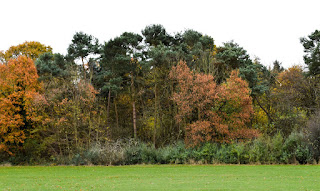
To edit this image I cropped a section of the grass out because it brought more focus to the trees as it was unnecessary space which took away the attraction of the trees. Also, I increased the darkness of the shadows which made the details of the trees stand out more because the shadows appear bold and darker. I increased the saturation too which made the colour of the trees stand out too which also grabs our attention too. By making the sky white it also adds to the effect of eeriness and makes the trees stand out more. 


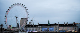
To edit this image I cropped the sky slightly and the bottom too because I wanted to draw attention to the London Eye and the building as these were the main focuses. As well as this I also increased the exposure of the image slightly because it made it look less dull, the sky appears brighter and helps the buildings stand out more. By increasing the saturation of the image makes the lights that are present in the building appear brighter and draws our attention more. I think the edited image appears better because it has a lighter mood and brighter colours.

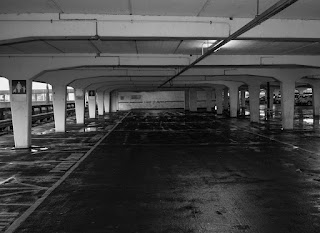
   

To edit this image I cropped it slightly to focus in on a small section of the car park, this added a better effect because we only look into this section rather than looking at other elements that are present in the image. Also, I changed it to black and white and increased the clarity, by doing this it increases the eeriness present in the picture as it appears darker. By making the image black and white the shadows appear blacker which creates a narrower depth of field than the original image as there is more darkness. I wanted to create more darkness in the image because it adds to the horror effect that I wanted to create. 

Tuesday, 6 December 2016

Faye Godwin Landscapes

Faye Godwin

Context
Fay Godwin (17 February 1931 – 27 May 2005) was a British photographer known for her black-and-white landscapes of the British countryside and coast. Born Berlin, Germany, father a British diplomat, mother an American artist. Educated at various schools all over the world. 1958 Settled down to live in London. 1966 Became interested in photography through photographing her young children. Her early and mature work was informed by the sense of ecological crisis present in late 1970s and 1980s England. Her work is a celebration of the British countryside, a lament for what has been lost and a warning about what will happen if action is not taken to preserve it. Through her publishing connections she began photographing writers, primarily for use as publicity material. Godwin’s husband died suddenly in 1976 and at around the same time she was diagnosed with cancer. Godwin recovered, but afterwards the direction of her work began to change. ‘After being ill, I concentrated more on the landscape. In a sense, all the natural things became incredibly important,’ she said in an interview for ITV’s The South Bank Show in 1986.

Photography

In this image we are presented with a road and at the end of this road we can see a mountain. This image makes us focus on the nature in the picture rather than the road. She has added great focus on the mountain because when we look at the image this is the first thing we naturally see as it is the brightest part in the image. Faye Godwin works with tone well because she has created different tones throughout the image, for example the road is a much darker, dull tone whereas the mountain is a lighter tone. We can link this image to the context because she wanted to represent landscape as something we need to protect and if we carry on changing the natural world it won't stay like this forever. This links to the photograph because she has darkened the road to make it seem like it is evil/bad compared to the nature. When we look at this image we can see that she wanted the road not to stand out but by doing this we are more attracted to the meaning of the photo. It can also be linked to her cancer illness, the dark road represents the illness and what she went through but the mountain can be represented as her recovery because it is bright and powerful. 


In this image we are shown a path going through the middle of the picture and surrounding the path we see a field with trees and a fence. This image makes us focus on the field surrounding the path because it looks neglected and the things growing on it look dead, the fence also looks like it is broken. In this image she has used tones again, for example the trees are a very dark tone and the sky is a lighter tone. We would think that she would make the trees a lighter tone to show them off but we can see in this picture that she wants to add the effect to make the deserted field the main focus. I think this is because she wants to show that the field needs to be looked after. This links to the context of Faye Godwin because she wanted to represent the dangers of the way we are living as it is effecting the nature in the world, in this image she is telling us that we have to look after nature otherwise it will end up looking like this. Another message that can also be portrayed from this image is the fact that the man made path and fence is making land look deserted, everything beyond the fence and the path looks neglected and poor. 


In this image we can see the countryside, Godwin has used a variation of tones in this image. The different tones consist of darker ones in the background of the image and lighter tones in the foreground of the image. I think she has used these tones because it makes us think that as the countryside goes on it starts to fade away. In her images she shows the sky with lighter tones, I think the message that she is trying to show is that even though the sky is light the land is dark which tells us that nature is becoming non-existent and less intriguing. This can link to the fact that she wants to celebrate nature because thing image portrays the fact that we have to protect nature otherwise it will fade away. Also, we can relate this image with her cancer story, the darkness in the background represents her past and the illness, the lighter parts of the image can represent her recovery and the future.

Progression
From evaluating Faye Godwin's work I can use various aspects of her ideas in my work. I can use her use of tones in her images when editing my photos I can make pats of the image darker or lighter to send a clearer message. Also I can use her technique of grasping nature in my work by taking pictures of landscapes that portray a lot of nature in them.

Monday, 5 December 2016

Landscape Straight Images


I chose to take this image because I think that it shows landscape well. I like the effect that the leaves make because it shows us the time of the year. The darkness displayed in the image also helps us work out the time of the year too because it is quite dark which helps us know that it is during autumn or winter, if it was during the summer we may have gotten the glare of the sun reflecting off of the sign. I like how this can be displayed as an urban area because it relates to the London underground. Also the train and the train track in the background also helps add to the effect because as well as looking at the station sign we are also drawn to things happening in the background.


I chose to take this image because I think it shows landscape really well. I like how this can be related to the rule of thirds because it is separated into three sections, the grass/ground, the forest/trees and then the sky. The sky helps the colours in the photo stand out more because it is white/grey so the colours appear brighter against it. If the sky was blue it wouldn't have the same effect as the grey sky does. The image also has an eerie effect because although the trees look colourful they also appear dark and not very inviting. Also, the sky is dull which also adds to the eerie effect. 


I chose to take this image because it shows landscape well as there is a great depth of field present in this image. I like how this image hasn't been taken straight on because by having it taken at a angle we are able to compare it to the small part of the outside we can see. This image has a horror effect to it because the end of the path our eyes follow is incredibly dark and creepy. I think the glare on the floor also adds to the horror/eerie effect because it suddenly stops and goes completely black. Also, I like that although the light from outside is present it doesn't light up the whole of the inside, this adds to the eerie effect because only some light is showing.


I chose to take this image because it shows landscape well as there is a great depth of field in the image. I like how their is a main focus on a few trees that are in the foreground but the background also interests us as it shows deep into the forest. Also, I like how the sky is light but because the photo has been taken in a forest it is dark inside making the image look eerie. Although the trees have virtually no leaves on them the picture still looks full and there are many things that take our attention. 


I chose to take this image because it shows landscape well as there is a great depth of field in the image as we can see far into the distance. The fact that everything in the background is blurred gives the image a better effect because we are drawn to it as we look at all the different lights there are. I like this image because it is very eerie and relates to horror because it is dark and the only lighter parts are in the foreground of the image.

Landscape Contact Sheet


Sunday, 27 November 2016

Landscape Mindmap


Landscape Image Bank


I like this image because its main theme throughout the image is autumn. The colours in this image draw us in because the different shades of orange can be seen. The sunlight in the photo gives a good effect because we can see it peeking through the trees as we can see the orange light reflections on the pavement. There is a great depth of field in this image because we can see far into the picture as the end of the path is visible. As we look deeper into the image the colours become lighter and the colours are darker in the foreground of the image. I can use ideas from this image in my work because I can take pictures in forests as well as in street areas. This image helps me widen my ideas of landscape photography.


I like this image as the flowers in the foreground are clear but as we look deeper into the image they become less clearer. This image also has a great depth of field because we can see deep into the image into the horizon. I think the sun also has a great effect because it adds brightness into the image, without it the image would be dull and dark with a different meaning. Also, I like the different colours that are in the image, the purple sky gives a good effect even though you would've thought that it would give a gloomy/scary effect. I can use ideas from this image in my work because I can take images of landscapes that may not seem very interesting but we can make them interesting.


I like this image because it is a realistic landscape and urban areas like this landscape is the type of images that I would be taking. The people in the background and the train coming through the station make this a more realistic image because when I take pictures I will have elements in my picture that I don't necessarily want in the image but I can stop it from happening. This image has a depth of field but not as good as other landscape images. We can see the depth of field on the right hand side of the image where we can see deep into where the train is coming from but the depth of field isn't the main focus. Another element of this image that I like is the fact that the train station sign is in colour but everything else is in black and white, this makes us realise what the photographer wants us to focus on.


I like this image because of the fact that it is a famous London landmark it draws us in and grabs our attention. This image at first looks dull because there is not much colour but I think that it is interesting. I think it looks like a painting when you look at it but I think the photographer has edited this image to give it a better effect. Although the lighting in the image looks dull I think it gives it an ancient effect which works well with the landmark because it is old. I think the depth of field in this image isn't as obvious as other images but we can still see it, in the background of the bridge we can see the buildings behind it. I can take ideas from this image by photographing things like famous landmarks or things like bridges to create a landscape but also include depth of field.


I like this image because I think the height of the buildings give a great effect because it almost seems like the buildings are enclosing in on the photographer as the height of the buildings are unclear. I also like the fact that the picture is in black and white because it makes the photo seem older and we are focused on the actual picture rather than the colours if it wasn't in black and white. This image can relate nicely with my photography because I will be able to get urban pictures like this one. The depth of field in this image is strong because we can see where the path ends, I think the height of the buildings add to the depth of field. 

Monday, 21 November 2016

Landscape Definition

Landscapes show all the visible features of an area of land, often considered in terms of their aesthetic appeal. When taking images of landscapes the recommended f stop is 20/22 because it gives a greater depth of field so we can see deep into the image.


Ansel Adams represents landscapes well as he has an interest in nature and takes photos mainly of landscapes.  

Ansel Adams is part of Group f/64. Group f/64 was a group of seven 20th-century San Francisco photographers who shared a common photographic style characterized by sharp-focused and carefully framed images seen through a particularly Western (U.S.) viewpoint. In part, they formed in opposition to the pictorialist photographic style that had dominated much of the early 20th century, but moreover they wanted to promote a new modernist aesthetic that was based on precisely exposed images of natural forms and found objects.

Ansel Adams uses pictorialism. Pictorialisman approach to photography that emphasizes beauty of subject matter, tonality, and composition rather than the documentation of reality.

The Zone System is a technique that was formulated by Ansel Adams and Fred Archer back in the 1930's. It is an approach to a standardized way of working that guarantees a correct exposure in every situation, even in the trickiest lighting conditions such as back lighting, extreme difference between light and shadow areas of a scene, and many similar conditions that are most likely going to throw off your camera's metering giving you a completely incorrect exposure. 


Previsualization is a function to visualize complex scenes in a movie before filming. It is also a concept in still photography. Previsualization is applied to techniques such as storyboarding, either in the form of charcoal drawn
sketches or in digital technology in the planning and conceptualization of movie scenery make up.