Landscape Work Diary
Evaluation

I think this is one of my better images as it has a great depth of field, we can see deep into the image as it is unclear when the path ends. Although the bushes aren't the main focus of the image we can still see them in great detail and they add great effect to the image. I think the path and bushes add a great effect to the image because this is naturally where our eyes follow. To edit this image I think I will make the sky lighter because I didn't want to create the darker tone that this image is showing, by making the image lighter it will have a better effect.

This is also one of my better pictures as it too has a great depth of field because we can see far in the distance to behind the buildings and in the direction the traffic is going in. I think the fact that we can see where I was standing where I took this image increases the depth of field too because our eyes naturally follow the wall into the distance. This picture is very dull but it adds effect to the image because the small lights we can see on the cars and the traffic light stand out against the dull lighting. To edit this image I will make the image lighter as a whole and maybe crop the sky slightly as this isn't the main focus.

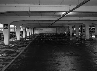
In my opinion, I don't think this was the best landscape image that I was able to take because it is quite dark and we can't see the car park very well. I like the way the sky looks in this image because the clouds are very low and clear. Instead of focusing on the real landscape this image really only focusses on the sky. To improve this image I could change the camera setting to allow in more light to make the car park seem brighter instead of really dark, if it wasn't so dark it would've been a good photo.

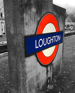
To edit this image I made everything other than the sign black and white. By doing this the main focus of the image stands out more. I think the edited version is better because we are drawn to the station sign rather than what is going on in the background. Making the image black and white also helps with taking away the effect of the leaves as the image appears better without them. Although the train in the background does add effect to the picture I decided it would look better black and white to draw more attention to the sign. As well as making it black and white I increased the saturation of the sing to make it stand out more and appear more vibrant.

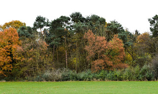
To edit this image I increased the exposure of the image which made it slightly brighter which helps increase the mood and prevent it from looking dark and dull. Also, I increased the saturation of the image which brightens the colour of the leaves on the trees and also brightens the colour of the sky. I think by doing this it has helped with the depth of field as we can see clearly into the back of the image. The edited image appears better because the colours are brighter and the image is less dull. Although the image looks good dull as it was in a forest which people would associate with a darker image I didn't want to spread this stereotypical idea.

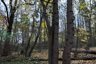
To edit this image I cropped a section of the grass out because it brought more focus to the trees as it was unnecessary space which took away the attraction of the trees. Also, I increased the darkness of the shadows which made the details of the trees stand out more because the shadows appear bold and darker. I increased the saturation too which made the colour of the trees stand out too which also grabs our attention too. By making the sky white it also adds to the effect of eeriness and makes the trees stand out more.

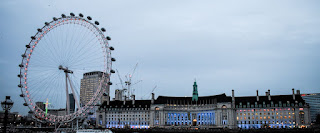
To edit this image I cropped the sky slightly and the bottom too because I wanted to draw attention to the London Eye and the building as these were the main focuses. As well as this I also increased the exposure of the image slightly because it made it look less dull, the sky appears brighter and helps the buildings stand out more. By increasing the saturation of the image makes the lights that are present in the building appear brighter and draws our attention more. I think the edited image appears better because it has a lighter mood and brighter colours.

To edit this image I cropped it slightly to focus in on a small section of the car park, this added a better effect because we only look into this section rather than looking at other elements that are present in the image. Also, I changed it to black and white and increased the clarity, by doing this it increases the eeriness present in the picture as it appears darker. By making the image black and white the shadows appear blacker which creates a narrower depth of field than the original image as there is more darkness. I wanted to create more darkness in the image because it adds to the horror effect that I wanted to create.
No comments:
Post a Comment