Showing posts with label Work diary. Show all posts

Sunday, 19 February 2017

Portraiture Work Diary

Portraiture Work Diary

Evaluation

I took some images of several different people to represent portraiture. We were given different photographers to base our photography around and I took images in a studio as well as picking different locations to take them in.


I took this image to represent the photographer Thomas Ruff because he takes serious images of different people to express them. I think this is one of my better pictures because it imitates a photographer well but has my own interpretation of the style of photography. Thomas Ruff's images are dull and slightly boring, however my image contains colour which makes us take a second look at the image as the colour is attractive to the eye. The colour of the background was linked with the girl because stereotypical girls like pink. A pink background makes her stand out because she is wearing white.


I took this image because I was experimenting with the settings on the camera. Trying out different locations helped test out the camera settings because we had to get the right settings to allow the right amount of light in. Personally, this is one of my better pictures because I like how the light in the picture is coming through the trees almost making her look like an angel. Although this is supposed to be a portraiture image I think the depth of field in this image adds effect to the image because we can see deep into the forest but we are still instantly drawn to her because the light is hitting her. I also like how the foreground is lighter than the background in this image.


Whilst experimenting with the different camera setting and locations to get a good picture there were some image that didn't turn out well. I think this image is included in the ones that didn't turn out well because the composition of the picture could've been put together better. The lighting is coming in at an awkward angle which exposes the bottom half of her at an angle which I don't particularly like. The natural lighting is also too bright so it didn't turn out as I expected.

Progression
To progress these images I put them into Photoshop and edited them to look better. 


To edit this image I increased the saturation of the image which made the colours of the leaves stand out more. I also increased the brightness of the image and darkened the shadows that are present in the image. Generally, this has made the foreground of the image stand out more because they appear slightly darker than the original image. The light coming through the trees also stands out more because we can see it clearly reflecting on her hood. The edited picture appears better than the original image because the depth of field appears more clearly and so does the girl.


To edit this image I made the background black and white to make her stand out more as she is the main focus of the image. I also increased the saturation of the girl which made her hair and skirt stand out more too. I think the edited image is better than the original image because the girl stands out more and when taking portraiture images you want the person to stand out more rather than the location they are in. The background being black and white helps draw attention to the girl because it takes away the slight depth of field the background has.


To edit this image I made it black and white to make all the colours blend into one. By making it black and white it makes us focus on her more rather than the colours around her. It links to Thomas Ruff's portraiture images more because they are every dull and boring so by taking away all the colours from this relates it more to his work. I think either image looks good because the first one is more attractive to the eye because it has more colour but the first one focuses more on the girl.


To edit this image I decreased the contrast of the image to reduce the colours in the image which gives a better effect to the image. I didn't like the yellow lighting in the original image so I wanted to reduce the yellowness in the image which I did by decreasing the contrast. I also darkened the shadows in the image which made his t-shirt black and make the shadow behind him darker which makes him stand out more.


To edit this image I made it black and white because I didn't like the colour of the lighting in the picture. I also cropped the image slightly to focus in more on the top part of the body. The edited image could be changed slightly by making her face a different shade of black/white because it is quite dark. If there was shadows in the image I would've darkened them because she would've stood out more. 


Physical Images Work Diary

Physical Images

Evaluation

I experimented using physical images linked to Barbara Kruger. I created 5 physical images using Barbara Kruger's theme. 


In this image we can see a boy holding his hands up wearing boxing gloves, he looks very intimidating. I chose to use the caption "equality, if they can we can" alongside this image because it tells us that if men can be powerful and strong then why can't women. Also, in the sporting industry women are not looked up to as much as men and in this instance it can also show us that if men can play sport then why can't women.


In this image we can see a boy doing his hair in the mirror. I chose to use the caption "who does he think he is" because it shows that he is selfish and not caring about anyone else. This links to the men that are in power because they are arrogant and selfish. I chose these words because they are similar to the Barbara Kruger's photo with the caption "who does she think she is".


In this image we can see a waist being measured. I chose to use the caption "not skinny enough" because we are expected to look a certain way and be a certain size. The picture has a big effect because it is in black and white so it gives a depressing effect which makes us feel sorry for the person getting their waist measured. As we don't know the gender of the person who is getting measured the meaning shows that everyone feels pressured to look a certain way whatever gender we are. 


In this image we can see a girl with extreme make-up. The caption "i want to be beautiful" shows us that girls feel pressured to look a certain way. The fact that the make-up is packed on shows us that maybe she is trying to cover something because she is insecure of herself. It shows us that girls feel pressured to look like the pretty girls that are portrayed in the media. 


In this image we can see a man with his hands behind his head looking depressed and sad. The caption "make the right decisions" gives the impression that he has done something wrong, I wanted to portray the men in the world now who are powerful and make the wrong decisions regarding women. This could also show that the man is depressed and sad about the world going on around him which show men as the same regarding feminism.

Saturday, 4 February 2017

Composite Images Work Diary

Composite Images

Evaluation
I created two sets of composite images, the first attempt of this topic didn't go that well because I chose the wrong objects as they didn't match with the location I chose. However, my second attempt turned out better than the first.


These first two images were my first attempt at trying to create some composite images. The idea I had didn't turn out well, I was expecting to try and create the objects like people but I struggled with this. If I had
chosen different objects it may have turned out well. A perfume bottle and lipstick doesn't really compliment the location that I have chose which is why it didn't turn out as well as I hoped. 


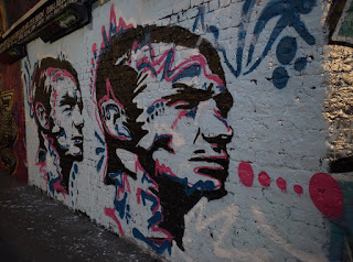
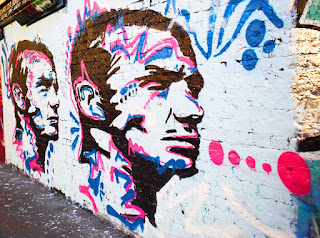
As my first attempt at composite images didn't turn out as well as I hoped I tried to create them again but with a different object and the same location. I think this object worked well with this location as it is cartoon character and graffiti is often associated with cartoon characters and writing. Also, this area looks like a rough area and not very upper class, this can link to the fact that the character is a shark because they represent fear. 

Tuesday, 31 January 2017

Landscape Work Diary

Landscape Work Diary

Evaluation

I think this is one of my better images as it has a great depth of field, we can see deep into the image as it is unclear when the path ends. Although the bushes aren't the main focus of the image we can still see them in great detail and they add great effect to the image. I think the path and bushes add a great effect to the image because this is naturally where our eyes follow. To edit this image I think I will make the sky lighter because I didn't want to create the darker tone that this image is showing, by making the image lighter it will have a better effect. 


This is also one of my better pictures as it too has a great depth of field because we can see far in the distance to behind the buildings and in the direction the traffic is going in. I think the fact that we can see where I was standing where I took this image increases the depth of field too because our eyes naturally follow the wall into the distance. This picture is very dull but it adds effect to the image because the small lights we can see on the cars and the traffic light stand out against the dull lighting. To edit this image I will make the image lighter as a whole and maybe crop the sky slightly as this isn't the main focus.


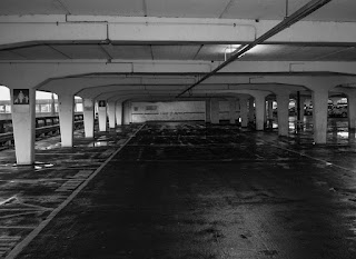
In my opinion, I don't think this was the best landscape image that I was able to take because it is quite dark and we can't see the car park very well. I like the way the sky looks in this image because the clouds are very low and clear. Instead of focusing on the real landscape this image really only focusses on the sky. To improve this image I could change the camera setting to allow in more light to make the car park seem brighter instead of really dark, if it wasn't so dark it would've been a good photo.

Progression


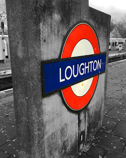
To edit this image I made everything other than the sign black and white. By doing this the main focus of the image stands out more. I think the edited version is better because we are drawn to the station sign rather than what is going on in the background. Making the image black and white also helps with taking away the effect of the leaves as the image appears better without them. Although the train in the background does add effect to the picture I decided it would look better black and white to draw more attention to the sign. As well as making it black and white I increased the saturation of the sing to make it stand out more and appear more vibrant.


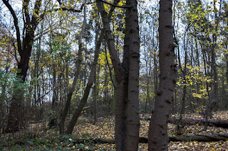
To edit this image I increased the exposure of the image which made it slightly brighter which helps increase the mood and prevent it from looking dark and dull. Also, I increased the saturation of the image which brightens the colour of the leaves on the trees and also brightens the colour of the sky. I think by doing this it has helped with the depth of field as we can see clearly into the back of the image. The edited image appears better because the colours are brighter and the image is less dull. Although the image looks good dull as it was in a forest which people would associate with a darker image I didn't want to spread this stereotypical idea.


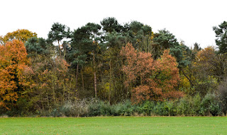
To edit this image I cropped a section of the grass out because it brought more focus to the trees as it was unnecessary space which took away the attraction of the trees. Also, I increased the darkness of the shadows which made the details of the trees stand out more because the shadows appear bold and darker. I increased the saturation too which made the colour of the trees stand out too which also grabs our attention too. By making the sky white it also adds to the effect of eeriness and makes the trees stand out more. 


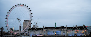
To edit this image I cropped the sky slightly and the bottom too because I wanted to draw attention to the London Eye and the building as these were the main focuses. As well as this I also increased the exposure of the image slightly because it made it look less dull, the sky appears brighter and helps the buildings stand out more. By increasing the saturation of the image makes the lights that are present in the building appear brighter and draws our attention more. I think the edited image appears better because it has a lighter mood and brighter colours.


To edit this image I cropped it slightly to focus in on a small section of the car park, this added a better effect because we only look into this section rather than looking at other elements that are present in the image. Also, I changed it to black and white and increased the clarity, by doing this it increases the eeriness present in the picture as it appears darker. By making the image black and white the shadows appear blacker which creates a narrower depth of field than the original image as there is more darkness. I wanted to create more darkness in the image because it adds to the horror effect that I wanted to create. 

Joiners Work Diary

Joiners Work Diary

From my research about joiners I was able to create 2 joiners, one of a building which I don't think is my best and one of a person which I prefer out of the two.

This was the first joiner that I created, I went out and took several images of this building and tries to piece it together to form a joiner. In my opinion I dislike this joiner because I couldn't piece it together properly as it doesn't go as well together as I had hoped. To improve this joiner and make it better I should've took smaller images of the building so it would've been easier to piece the images together to make it seem like an actual image. I think this was good for my first attempt at making an joiner but I feel as though I could take another image of a building and try again. Instead of taking zoomed out images of the building I could've zoomed in further and captured smaller sections of the building to make the piecing together stage easier.


I created a second joiner of a person, I used a studio to take several images of this persons body and pieced them together to form a joiner. In my opinion, I think this is my best joiner as although we can see where it has been pieced together and doesn't actually look realistic we can still clearly see where each of her body features are. I think this joiner worked out better then the building joiner because I took smaller sections of her body and pieced them together rather than taking bigger sections. To improve this the only thing I would do is take the pictures on a different background instead of a ripped one. If I was going to progress further with joiners I would take someone face and create a joiner. 

Sunday, 1 January 2017

Photoshoot 1 Work Diary

Evaluation
I went around London and took images of several different places and things that displayed London well. Some of these images proved to work as I liked others weren't as good as others.


I chose to take this image of telephone boxes because they have an element of importance to London and have a significant meaning. The fact that they were on a dull street made me want to take a photo because they stand out against the dull colours. When you are walking down this street they catch your attention immediately because of their bright colour.


I chose to take this image of a man busking because this also has an element of importance to London because when you walk around London there are people busking and making money from their talents everywhere. The fact that there is a bus going past in the background adds a great effect to this image because it makes the man stand out a bit more. This image also relates to Henri-Cartier Bresson because this photo uses the decisive moment as I had to take the image at the right time to be able to capture the bus at the time.


This image didn't work as well as I would've liked it too, I wanted to capture the floor drawings but the angle that I have taken it at hasn't worked out well. To improve this image I could've taken it at a different angle so that the image would've turned out better and the cones and bags wouldn't be present in the photo. I wanted to take this image because it shows street art which shows importance in London because there are a lot of people who do street art.

Progression
To progress these images further I took some images and put them into Photoshop to edit them.


To edit this image I cropped out the unwanted parts to focus in more on the graffiti, also I increased the brightness and the saturation which made the graffiti colours brighter and stand out more. The edited version of this image is better because it attracts our attention slightly more than the original image does because it is brighter and more colourful. To improve this image further I could make it duller because this would give a different meaning to the image and make it seem more eerie.


To edit this image I increased the yellow tint of the image which made the more natural light stand out more, I also increased the effect of the shadows slightly along with increasing the intensity of the blacks. Also, I reduced the effect of the highlight and increased the intensity of the while colour. Finally, I decreased the clarity of the image. By editing the image in this way the blur of the bus stands out more and so does the man. I think the edited photo grasps our attention more than the original image because there are more colours and it is brighter. I could edit this in several different ways such as making it black and white.


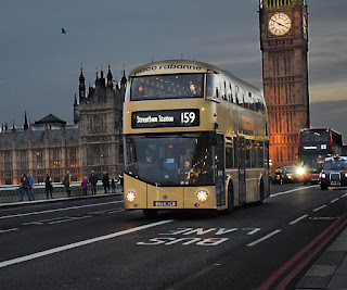
To edit this image I made the sky and the road darker to create a night time effect. Also, I brightened the buildings and the traffic to make them stand out. I also sharpened everything and cropped out the left side to avoid the building work. I think the edited version is better as everything stands out a bit more and looks better if it was night. In the original image the sky is dull and grey so I wanted to change it to make the mood better, although the edited version is dark it still displays a lot of colour and lights. To progress this image further I could've tried to make it look brighter and like day time rather than night time.


To edit this image I increased the exposure of the whole the image which makes the blue in the sky stand out more and the building in the left hand corner seems less dark. I also increased the sharpness of the image to make the branches stand out more. I think the edited version of this image appears better because it is brighter and more colourful. By making this image more colourful and brightening the mood it makes the famous icon stand out more. I could've edited it differently by making it duller and maybe look a bit eerie by darkening the sky and trees.