I went around London and took images of several different places and things that displayed London well. Some of these images proved to work as I liked others weren't as good as others.
I chose to take this image of telephone boxes because they have an element of importance to London and have a significant meaning. The fact that they were on a dull street made me want to take a photo because they stand out against the dull colours. When you are walking down this street they catch your attention immediately because of their bright colour.
I chose to take this image of a man busking because this also has an element of importance to London because when you walk around London there are people busking and making money from their talents everywhere. The fact that there is a bus going past in the background adds a great effect to this image because it makes the man stand out a bit more. This image also relates to Henri-Cartier Bresson because this photo uses the decisive moment as I had to take the image at the right time to be able to capture the bus at the time.
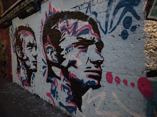
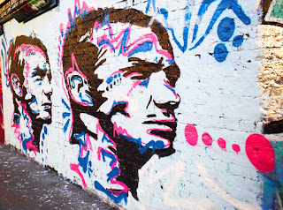
This image didn't work as well as I would've liked it too, I wanted to capture the floor drawings but the angle that I have taken it at hasn't worked out well. To improve this image I could've taken it at a different angle so that the image would've turned out better and the cones and bags wouldn't be present in the photo. I wanted to take this image because it shows street art which shows importance in London because there are a lot of people who do street art.
Progression
To progress these images further I took some images and put them into Photoshop to edit them.


To edit this image I cropped out the unwanted parts to focus in more on the graffiti, also I increased the brightness and the saturation which made the graffiti colours brighter and stand out more. The edited version of this image is better because it attracts our attention slightly more than the original image does because it is brighter and more colourful. To improve this image further I could make it duller because this would give a different meaning to the image and make it seem more eerie.
To edit this image I increased the yellow tint of the image which made the more natural light stand out more, I also increased the effect of the shadows slightly along with increasing the intensity of the blacks. Also, I reduced the effect of the highlight and increased the intensity of the while colour. Finally, I decreased the clarity of the image. By editing the image in this way the blur of the bus stands out more and so does the man. I think the edited photo grasps our attention more than the original image because there are more colours and it is brighter. I could edit this in several different ways such as making it black and white.


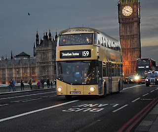
To edit this image I made the sky and the road darker to create a night time effect. Also, I brightened the buildings and the traffic to make them stand out. I also sharpened everything and cropped out the left side to avoid the building work. I think the edited version is better as everything stands out a bit more and looks better if it was night. In the original image the sky is dull and grey so I wanted to change it to make the mood better, although the edited version is dark it still displays a lot of colour and lights. To progress this image further I could've tried to make it look brighter and like day time rather than night time.


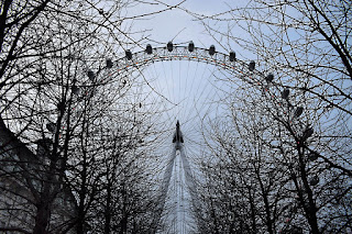
To edit this image I increased the exposure of the whole the image which makes the blue in the sky stand out more and the building in the left hand corner seems less dark. I also increased the sharpness of the image to make the branches stand out more. I think the edited version of this image appears better because it is brighter and more colourful. By making this image more colourful and brightening the mood it makes the famous icon stand out more. I could've edited it differently by making it duller and maybe look a bit eerie by darkening the sky and trees.


No comments:
Post a Comment