
I took this image on the black and white setting on my camera because I think it created a better effect than if I was to take it on the normal setting. This picture has a lot of tones because we can see the shadow that is represented on the wall behind her and the fact that half of her face is almost in darkness. I think her mood is represented by her face and the dullness because it seems like an unhappy image as we can tell how she is feeling. I could've taken this image in colour instead of black and white but I wanted to express the feelings more than a normal photo.


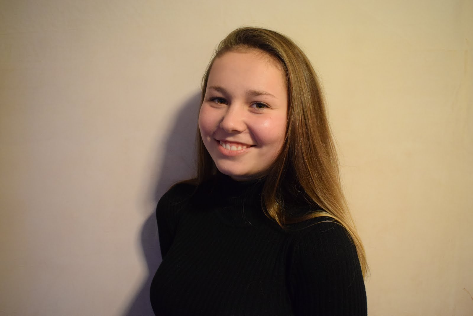
I like this photo that I took because I think the lighting represents the feeling in the picture. The fact that the lighting is bright makes the mood more happier and because she is smiling we can understand her mood better. I also like the contrasting of colour in this picture where she is wearing a black top but everything else is in colour as it makes her face and feeling stand out rather than what she is wearing. I could edit this by making it black and white but I think I am just going to increase the brightness and saturation because I want to keep the mood the same.

In this picture the girl stands out because of the colours she is wearing. The fact that she is wearing white means that she stands out against the greens and the browns of the forest behind her. I like how the sunlight is shining through the tress and onto her, the light almost represents a spotlight pointing in her direction to make her stand out even more. Although the background is blurry there is still a great depth of field because we can see the trees in the distance. I think it helps that the background is blurry because it helps her stand out more as she is the main focus in the image.

This picture was taken in a studio with lighting and a background. The fact that there is a pink background links to the fact that she is a female, the brighter colours gives the set up a feminine touch as if it was a male in the picture we would've seen darker, less vibrant colours. This picture appears better with colours because we can see the details in her face. Also, the background helps her stand out because the white stands out against the pink along with her hair and face.

I like this picture because there is a lot going on in the background but we still manage to focus on her as she is the main focus of the image. The fact that the background is blurry also helps us focus on the girl more as we are not distracted by things going on in the background. I think the colours she is wearing also helps her stand out because she is present on a background where the colours she is wearing are virtually non-existent. I think I am going to crop this image in further because it will help focus on her more.
No comments:
Post a Comment