Monday, 3 October 2016

Form Definition

Form is a three dimensional shape, such as a cube, sphere or cone. Sculpture and 3D design are about creating forms. In 2D artworks, tone and perspective can be used to create an illusion of form. 


This image links to form because it shows us a picture of a 3D image which we can establish the shape of the object from. We can tell from this picture that this is 3D from the shadows created. The key thing for form is the light source to create the shadow showing us the object is 3D.


A shape is an area enclosed by a line. It could be just an outline or it could be shaded in. Shapes can be either geometric, like a circle, square or triangle, or irregular.


This image links to shape because there is no light source that shows us that the shapes that we see are not 3D they are just 2D shapes.

Saturday, 1 October 2016

Texture Work Diary

Evaluation
In the images I have taken some of them have turned out very well but others haven't turned out how I would've liked them to. I have a some best images and some worse images that haven't presented texture like I would've liked.


I think this image is one of my best images because it represents texture well and the texture of the object in the image is clear. In this image hard lighting is used because hard light makes distinct, hard-edged shadows. By editing this image I think I can improve it. I don't think I need to retake this image because the lighting helps the texture become clear. The angle of this image is also good because if it was taken at any other angle it would've ruined the image because the texture of the object wouldn't of been clear.


I think this image is one of my best images because it represents texture wells as the texture of the cat is present well. I think everything about this image is good and the only way I can improve it further is by editing it. I think the lighting and the focus of the image helps us identify the texture because they help the focus of the texture become more clearer. The angle of this image is also good because we are able to see the details of the cat become clear.


I think this image is one of my worst pictures I took because it doesn't represent texture as I would've liked. Also the picture is slightly out of focus and I think it is not clear what I was trying to show in this image. To improve this image I think I could get closer into the fur to show the texture more. The angle of the image is what lets this picture down because if it was taken at a different angle I would've used it as one of my best.

Progression
To improve the images that I have taken I used Photoshop to edit the photos to progress them.

    
I edited this image by making it black and white and sharpening the image to make the texture clearer. Also, I brightened the image to make the texture clearer. I think the edited version is better than the original photo because the black and white makes us focus more on the texture rather than the colours in the image. The sharpness of the image makes us focus on the individual hairs rather than any other aspects of the image. To progress this image more I think I could've taken this image at a wider angle so that we can see more of the texture.
      

To edit this image I just sharpened it. By sharpening this image the cracks and the unevenness of the wall has become more obvious. I think the edited version of the photo is better than the original because the texture of the wall has become more obvious. To progress this image further I think I could use a wider angle so we can see more of the texture of the wall. 


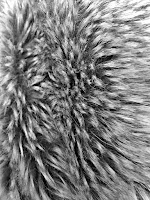
To edit this image I made the photo black and white and also sharpened it. By sharpening the image we focus on the individual hairs on the image so that we can imagine how it feels. I think the edited version of this image is better because we can focus on the texture of the fur more. To progress this image further maybe I could've edited the image by just sharpening it to make it more realistic.


To edit this image I made the photo black and white and increased the brightness whilst also increasing the sharpness of the image. By increasing the sharpness it enables us to see the bumps of the image clearer so we can imagine the texture of the object. To improve this image further when I take the image I could use a brighter light so there would be more light reflecting on the object so that the texture will become even more visible.


To edit this image I sharpened it and then brightened the image. By increasing the sharpness we are able to see the fibres of the cloth so we can imagine what it would feel like. Also, by increasing the brightness of the image we are able to see the texture better because the image is brighter so we can focus on the texture more. To progress the image further I could make it black and white to take the focus off of the colours.

Next time I get to take picture relating to this topic I will use these improvements.

Pattern Work Diary

Evaluation
I took some images relating to pattern, in each image I have tried to incorporate pattern as best as I could. I tried to incorporate regular and irregular patterns in the photos. In the images I have taken some of them have turned out very well but others haven't turned out how I would've liked them to. I have a some best images and some worse images that haven't presented texture as I would've liked.


I think this is one of my best images because the regular pattern that is present is very obvious in the image. The focus of the image and the angle of the image has worked well because the patter is sharp and is clearly seen. I like this image because the texture of the pattern can also be seen as well as the pattern which gives it a greater effect as the pattern is seen to stand out.  To improve this image I could've focused in more on smaller sections of the pattern because it would become more clear. 


I think this is also one of my best images because the irregular pattern is clearly seen in the image.  Next time if I was taking this image again I think that I would've taken the image more closer up to make the pavement tiles more obvious. By editing this photo I could make the pattern bolder to make it stand out more and make it more obvious that it is an irregular pattern.


I think that this is one of my worst photos because the pattern is not clear whether it is regular or irregular because the pattern is not clear. In this image I was trying to take the pattern of the football in the image but it didn't turn out as I would've liked it. Next time if I was taking the image again I would've made it more zoomed out and placed it on a white background so that the pattern was more clearer in the image.

Progression
To progress the images that I have taken I have used Photoshop to edit the photos to improve them.


To edit this image I have made the photo black and white, I have increased the darkness of the black of the green colours and brightened the white of the other colours to make the flowers stand out more against the darker colour. I think the edit of the photo is better because it shows the pattern better and makes it stand out more. To progress this image further, next time I think I should include more of the pattern in the image so have a wider image angle.


To edit this image I have decreased the brightness of the photo to make the pavement slabs stand out more. Also, I have increased the saturation of the colours which also made the pavement stand out more. I think the edit of this photo is better than the original image because the irregular pattern stands out more and so do the colours. To progress this image further I think that I could try different effects with the picture such as making it black and white to see if it progresses the image in any way.


To edit this image I have increased the saturation of the image which makes the pattern bolder and more visible. I think think the edit of this photo is better because the pattern is bolder and brighter which makes the regular pattern more visible. To progress this image further I could've also sharpened the image to make it more bolder. Also, next time I could also make this image black and white which would've also increased the boldness of the pattern.


To edit this image I have made it black and white whilst increasing the darkness and the lightness of the different colours to make the shapes stand out more. I think the edited version of this image is better than the original image because the regular pattern is bolder and stands out more. To progress this image further I could've sharpened the image and also saturated the colours more.


To edit this image I have increased the saturation of the colours, this makes the pattern stand out more because the colours are bolder. I think the edited version of this photo is better because the original photo is duller and not bold unlike the edited version. To progress this image further I think I could make the image black and white and then sharpen the image to make it bolder.

Next time I have an opportunity to take videos linked to this topic I will use these improvements to make my photography better.

Texture Straight Images


I took this image of a cat because I wanted to focus right in on the fur as I wanted to see if I would be able to get very close that you would be able to see the texture of the fur. I think I have achieved this because not only can you establish the texture of the fur but you can also see the whiskers which can also show texture as the image shows them to be spiky. I like this image because I think it has turned out very well.


I took this image of a wall because I wanted to focus on the cracks in the walls to show that the wall is rough and not smooth. This image links to texture because we can see the unevenness of the wall and we can image what it would feel like. I think I have achieved the concept of texture in this image because the angle I have taken this image at enables us to see the cracks and the unevenness of the wall.


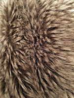
I took this image because it links to texture well as we are able to see the individual hairs of the jackets fur that helps us image what it would feel like. I like this image because it is an abstract image as when you first look at it it isn't noticeable straight away what the image is. I think I have achieved the concept of texture in this image because we can image that it would feel soft.


I took this image because I wanted to see if I could get the small fibres on it to stand out as it makes us think about what the object would feel like. I think that I have grasped the idea of texture in this image as the angle that the photo was taken at enables us to be able to see the small fibres and fur on the object which helps us imagine how it would feel.


I have taken this image because I wanted to focus on the bumps of the object. I think I have created the image well that you are able to see the texture of the object. We can tell that the object is bumpy by the way the bumps stand out. Also the angle that I have taken the image at helps because if i would've used another angle it might not have been as clear to see the bumps. I think that this is one of my best images because the texture of the object really stands out.

Pattern Straight Images


I took this image because I think it represents pattern well as it is the same thing being repeated over again. This image represents regular pattern because the pattern doesn't change it stays the same. The fact that this pattern was present on a piece of kitchen roll was a good idea because it's not normally what you would expect someone to take a picture of. I think this is a good representation of pattern because we are able to see clearly what the pattern is.


I took this image because it represents pattern well. This is a representation of regular pattern because the same set of flowers are being repeated over and over again on the curtains. This pattern could be considered as being irregular because it seems that it isn't the same pattern of flowers being repeated but it is. I think I could've zoomed out more on this image to show the pattern in more detail.


I took this image because it represents a pattern well, this is a representation of regular pattern as the same arrangement is being repeated over and over again. This pattern could also be considered as being irregular because it seems like the same thing isn't being repeated but the same arrangement is. I think I could've zoomed out on this image because it would've been clear what the pattern was.


I took this image because it represents pattern well as it shows an irregular pattern. The pavement is being repeated over again but in different shapes, sizes and colours. I think this image represents pattern well because you have to look deeper into the image to see the pattern instead of seeing it directly. 


I took this image because it represents a regular pattern as the same shape is being repeated over again which represents a regular pattern. I think this image has turned out well because the pattern is obvious to whoever is looking at the image. I also like the fact that to someone looking at the image they aren't sure what it is, on first look someone would think this is a picture of floor tiles but it is actually wall tiles. I like this image because it is a good representation of pattern.


Texture Contact Sheet


Pattern Contact Sheet