Friday, 13 January 2017

Connecting Essay 2

Connecting Essay

Annie Leibovitz


In this image we can see Meryl Streep with extravagant makeup and she is pulling the skin on her face. Meryl Streep is a famous actress and singer, she is looked on by the public eye constantly and is looked up to by people inspiring to be her. Actresses have to play different roles constantly, this could relate to the fact that she is pulling her face around, she is imitating how she feels going from role to role. Another meaning that can be linked to this image is that make-up is just a mask and it doesn't always make us look good. The fact that she has a pale face can show that she feels drained as she is forced to look a certain way just because she is a celebrity.

I think Annie Leibovitz was trying to display a different side to Meryl Streep that we don't normally see normally. She isn't wearing tons of nice make-up or nice clothes and her hair isn't styled. It tells us that what we see on the TV or in the magazines shouldn't be what we judge the person on. 


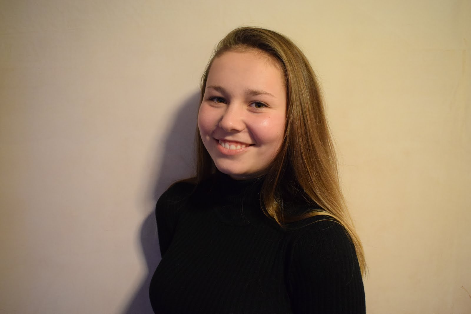
In this image we can see a girl with extravagant make-up. The outlines on her face show the stereotypical way that people apply make-up by contouring and highlighting, the outcome of these methods is to make your face look chiseled and certain areas stand out more, practically changing your whole face. I emphasised on this because in normal pictures of girls you see her with a full face of make-up instead of what they actually go through to achieve the way they look. This can relate to the pressures of wearing make-up and wearing it in the correct way or the way that everyone else does. The picture relates to Annie Leibovitz's photo because they both bring very similar meanings to the table. They both spread that there is pressure to look a certain way with make-up and without make-up. 


Thursday, 12 January 2017

Connecting Essay 1

Connecting Essay 1

Lauren Greenfield


 Image Link

In this image we can see a line go girls in their swimming costumes/underwear waiting to be measured. The girl in the front is having her bus measured with a tape measure. Also, the girls are holding tickets, this suggests to us that they are measured regularly and they write their measurements down on this ticket. These girls are obviously aiming to be a certain measurement. I think Laura Greenfield was aiming to spread the efforts that certain teenage girls have to go through because of the pressure to be a certain size. These girls must be models or aiming to be models as models are made to be a certain size. I think that she has portrayed the fact that girls go through a lot of pressure as they look up to the faces that we see on the front of magazines and the celebrities that are in the public eye. 

Some people may not like this image because it is a candid moment and she hasn't asked them to stand in a certain way. I like the image because it displays a meaning and represents real life issues rather than showing thin and pretty girls being measured she has chosen bigger and less attractive girls which has more of an effect to the fact that they feel pressured. 


In this image I took we can see someone waist being measured using a tape measure. The fact that we cannot see who is measuring the person or who the person is makes us read into this more because we are intrigued to know who it is. By leaving the gender of the person being measured unknown the meaning of the image becomes open to both genders showing us that there is pressure in both genders. Similar to Laura Greenfield I have captured the pressure of being a certain size and wanting to look a certain way. Unlike her image which was candid this image wasn't, I specifically asked someone to pose in this way.

I edited this photo in Photoshop to further improve it. I made the image black and white which gives it more of an effect, it makes the image bold but dull at the same time which is similar to it's meaning. I also increased the clarity of this image to make it stand out more. 


Sunday, 8 January 2017

Photoshoot 1 Straight Images


I took this image because I liked how the lights stand out against the darker colours. Also, I like how we are not just looking at the hotel as there are trees included in the shot which adds effect to the image. I was interested in taking this image because the hotel is situated on a corner rather than straight on a road, the fact that it is on a corner gives the image a lot of depth of field because we can see deep down the left side of the hotel. I think this represents the topic of London well because when we walk around there are several different hotels that all look different.


I took this image because I liked how the tunnel appears as dull and dark but the graffiti around the outside brings it to life more. This graffiti tunnel is located in the nicer areas of London which confuses us because we don't relate these sort of scenes in posher and upper class places. I was interested in taking this image because it straight away took my attention because of the bright colours. Also, I like how this can be perceived as a deserted area because of the greenery hanging down and the lack of cleanliness. I think it represents London well because it shows the areas that people might not think of straight away.


I took this image because I wanted to capture Big Ben but in a different way to the stereotypical pictures of it alongside the Houses of Parliament. I was interested in taking this image because I wanted to incorporate other buildings and the road as well as Big Ben. Although there is a lot going on in this image the main focus of Big Ben is still visible and clear. I think this represents London well because it shows a main landmark and what is happening around it on a normal day. 


I took this image because I wanted to capture the importance that this building showed and how it stands out against everything else. Although this building is not famous at all and is just a hotel I was interested in how it is made to look important and stands out against all the traffic which is passing by. The fact that this is a hotel shows us that hotels in London are made to stand out and have some importance because everyone looks different and is different.


I took this image because I wanted to capture the importance of the Big Ben. I think it helps in this instance that some of the Houses of Parliament is existent in this image because it makes Big Ben stand out more as it dominates over the building. I think the colour of the sky adds effect to the image, the fact that is is dull makes the buildings stand out. I think this represents London well because it is a famous landmark and it stands out as it is well known.

Thursday, 5 January 2017

Annie Leibovitz

Annie Leibovitz

She was born on October 2, 1949. She is the first woman to have held an exhibition at London’s National Portrait GalleryLeibovitz is much influenced by Richard Avedon. She began taking photos when her and her family moved around with her father who was in the U.S Air Force. She began working for the Rolling Stones magazine where people we attracted to her famous portraits of celebrities. 

Photography


In this image we can see Meryl Streep, she has white face paint on her face and she is pulling it in different directions. This image is a very plain image and there isn't much colour in it. The deeper meaning of this image can link to Meryl Streep and the fact that she is an actress. She has played many characters, the fact that she is pulling her face around can show this is how she feels when she has to go from character to character. Also, Leibovitz may be trying to show the actress in a different light rather than the make-up that we would normally see her with. This image is showing us that although we see these types of people with nice hair and make-up, this isn't what they look like all the time. It shows that young girls shouldn't inspire to be these people just because they look nice.


In this image we can see a little girl with blue eyes and dirt on her face, the wind is blowing her hair in her face. We recognise this image from the film les misérables. Looking at this image and not thinking of the film we see a little girl that look homeless because of the dirt on her face. The colour blue represents loyalty, wisdom, strength and trust. The fact that her eyes are blue shows us that although she may be homeless and have nothing she still has hope in her eyes and in her mind. The deeper meaning of this image can show that although you have nothing, if you hope and dream you might make it.


In this black and white image we can see Adele with her hair blowing in the wind. Unlink her image of Meryl Streep, Annie Leibovitz has made this image of Adele look attractive. In my opinion, she has made Adele look attractive because the media didn't display Adele as an attractive figure before 2016. The picture appears black and white to link with Adele's music. Her music is deep and sad which goes well with the colourless picture Leibovitz has produced. 

Wednesday, 4 January 2017

Portraiture Straight Images


I took this image on the black and white setting on my camera because I think it created a better effect than if I was to take it on the normal setting. This picture has a lot of tones because we can see the shadow that is represented on the wall behind her and the fact that half of her face is almost in darkness. I think her mood is represented by her face and the dullness because it seems like an unhappy image as we can tell how she is feeling. I could've taken this image in colour instead of black and white but I wanted to express the feelings more than a normal photo.


I like this photo that I took because I think the lighting represents the feeling in the picture. The fact that the lighting is bright makes the mood more happier and because she is smiling we can understand her mood better. I also like the contrasting of colour in this picture where she is wearing a black top but everything else is in colour as it makes her face and feeling stand out rather than what she is wearing. I could edit this by making it black and white but I think I am just going to increase the brightness and saturation because I want to keep the mood the same.


In this picture the girl stands out because of the colours she is wearing. The fact that she is wearing white means that she stands out against the greens and the browns of the forest behind her. I like how the sunlight is shining through the tress and onto her, the light almost represents a spotlight pointing in her direction to make her stand out even more. Although the background is blurry there is still a great depth of field because we can see the trees in the distance. I think it helps that the background is blurry because it helps her stand out more as she is the main focus in the image.


This picture was taken in a studio with lighting and a background. The fact that there is a pink background links to the fact that she is a female, the brighter colours gives the set up a feminine touch as if it was a male in the picture we would've seen darker, less vibrant colours. This picture appears better with colours because we can see the details in her face. Also, the background helps her stand out because the white stands out against the pink along with her hair and face. 


I like this picture because there is a lot going on in the background but we still manage to focus on her as she is the main focus of the image. The fact that the background is blurry also helps us focus on the girl more as we are not distracted by things going on in the background. I think the colours she is wearing also helps her stand out because she is present on a background where the colours she is wearing are virtually non-existent. I think I am going to crop this image in further because it will help focus on her more.

Portraiture Contact Sheet


Sunday, 1 January 2017

Photoshoot 1 Work Diary

Evaluation
I went around London and took images of several different places and things that displayed London well. Some of these images proved to work as I liked others weren't as good as others.


I chose to take this image of telephone boxes because they have an element of importance to London and have a significant meaning. The fact that they were on a dull street made me want to take a photo because they stand out against the dull colours. When you are walking down this street they catch your attention immediately because of their bright colour.


I chose to take this image of a man busking because this also has an element of importance to London because when you walk around London there are people busking and making money from their talents everywhere. The fact that there is a bus going past in the background adds a great effect to this image because it makes the man stand out a bit more. This image also relates to Henri-Cartier Bresson because this photo uses the decisive moment as I had to take the image at the right time to be able to capture the bus at the time.


This image didn't work as well as I would've liked it too, I wanted to capture the floor drawings but the angle that I have taken it at hasn't worked out well. To improve this image I could've taken it at a different angle so that the image would've turned out better and the cones and bags wouldn't be present in the photo. I wanted to take this image because it shows street art which shows importance in London because there are a lot of people who do street art.

Progression
To progress these images further I took some images and put them into Photoshop to edit them.


To edit this image I cropped out the unwanted parts to focus in more on the graffiti, also I increased the brightness and the saturation which made the graffiti colours brighter and stand out more. The edited version of this image is better because it attracts our attention slightly more than the original image does because it is brighter and more colourful. To improve this image further I could make it duller because this would give a different meaning to the image and make it seem more eerie.


To edit this image I increased the yellow tint of the image which made the more natural light stand out more, I also increased the effect of the shadows slightly along with increasing the intensity of the blacks. Also, I reduced the effect of the highlight and increased the intensity of the while colour. Finally, I decreased the clarity of the image. By editing the image in this way the blur of the bus stands out more and so does the man. I think the edited photo grasps our attention more than the original image because there are more colours and it is brighter. I could edit this in several different ways such as making it black and white.


To edit this image I made the sky and the road darker to create a night time effect. Also, I brightened the buildings and the traffic to make them stand out. I also sharpened everything and cropped out the left side to avoid the building work. I think the edited version is better as everything stands out a bit more and looks better if it was night. In the original image the sky is dull and grey so I wanted to change it to make the mood better, although the edited version is dark it still displays a lot of colour and lights. To progress this image further I could've tried to make it look brighter and like day time rather than night time.


To edit this image I increased the exposure of the whole the image which makes the blue in the sky stand out more and the building in the left hand corner seems less dark. I also increased the sharpness of the image to make the branches stand out more. I think the edited version of this image appears better because it is brighter and more colourful. By making this image more colourful and brightening the mood it makes the famous icon stand out more. I could've edited it differently by making it duller and maybe look a bit eerie by darkening the sky and trees.