The focus of my photographs was colour, I tried to take pictures using muted colours, analogous colours and complementary colours. In my images I was trying to incorporate one of these types of colours in my work. Personally, I think the majority of my photographs have followed the focus of the topic well but some have not turned out the way that I would've liked them to. Some ideas that I had didn't work as well as other ideas that I had.
This image I have taken worked particularly well because complementary colours as the green in the background helps the red/pink stand out in the foreground. The focus of the picture is also good as the flower is mainly in focus unlike the background which is not in focus on purpose. I think is one of my best images as the focus is good and complementary colours have been used so it links to the main topic well.
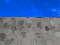
This image I have taken has also worked particularly well because I was able to incorporate muted colours as well as analogous colours. The blue sky makes the muted colours come to life because it makes them stand out. The focus of the image is also good because although it is zoomed in the focus has come out well. Also, this image can be seen as abstract because it is unsure when you first look at it that it is a sky and this can be perceived as something else to other people. I think this is one of my best images because it links to the main topic well.
This image I have taken is an example of images that are not linked to the topic well and are not very good photos. This image doesn't link to any of the colours such as muted, analogous or complimentary as there is really only one main focus colour of the image whereas in some of my other images more than one main colour is achieved in the picture. Also, the focus of this image is not the best because it looks slightly out of focus. I think this is one of my worst pictures as it doesn't really relate to the main topic as such.
Progression
To progress the images that I have taken I used Photoshop to improve the images I have taken.
To edit this image I have increased the contrast of the colour of the flower and made the entire background black and white. This is linked to muted colours as the colours in the background have been completely taken away to create the main focus of the image clear. To improve this image further I could have taken more than one of these flowers and used them in the image to create a bigger effect of saturated colours and muted colours.


To edit this image I have made the wall black and white and increased the contrast of the sky. This is linked to muted colours as I have made the colours of the wall further muted to add a greater effect to the sky. Also, this could link to saturated colours as I have made the blue brighter and bolder. To improve this image I could have included more in the shot such as a larger sky and wall surface area and maybe increase the saturation of the wall instead of the sky.
To edit this photo I made the background black and white and increased the saturation of the colours of the flowers. This can link to muted colours as there are no existent colours in the background. Also, it can link to saturated colours because I have made the colours of the flowers bolder and brighter. To improve this photo I could've made more of the other flowers in shot and took the photo at an angle where the sun wasn't reflecting in the image as much.
To edit this photo I made everything in the picture black and white except the blue sections of the bench and I increased the saturation of the blue. This can link to muted colours because I have made every colour other than blue non-existent. To improve this photo I could've taken the picture at a different angle to create and abstract effect.


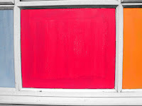
To edit this photo made the outside of the colours black and white and increased the saturation of the colours. This links to muted colours because there are no other colours in the image apart from the square sections. This can also link to saturated colours because the colours have been saturated to look brighter and bolder. To improve this image I could've made the image more zoomed out to show the other painted sections.
Next time I am able to take picture regarding this topic I will use these improvements in my work.


Hi Hannah high fives this post is really good I would like another print see me to discuss... the building with the skyline...
ReplyDeleteReally good here Hannah please try to maintain this standard across all assignments as I would grade this at the B+/A- There is a need for you to show more experimentation to gain a higher mark... OVERALL WELL DONE
ReplyDelete