Tuesday, 31 January 2017

Landscape Work Diary

Landscape Work Diary

Evaluation

I think this is one of my better images as it has a great depth of field, we can see deep into the image as it is unclear when the path ends. Although the bushes aren't the main focus of the image we can still see them in great detail and they add great effect to the image. I think the path and bushes add a great effect to the image because this is naturally where our eyes follow. To edit this image I think I will make the sky lighter because I didn't want to create the darker tone that this image is showing, by making the image lighter it will have a better effect. 


This is also one of my better pictures as it too has a great depth of field because we can see far in the distance to behind the buildings and in the direction the traffic is going in. I think the fact that we can see where I was standing where I took this image increases the depth of field too because our eyes naturally follow the wall into the distance. This picture is very dull but it adds effect to the image because the small lights we can see on the cars and the traffic light stand out against the dull lighting. To edit this image I will make the image lighter as a whole and maybe crop the sky slightly as this isn't the main focus.


In my opinion, I don't think this was the best landscape image that I was able to take because it is quite dark and we can't see the car park very well. I like the way the sky looks in this image because the clouds are very low and clear. Instead of focusing on the real landscape this image really only focusses on the sky. To improve this image I could change the camera setting to allow in more light to make the car park seem brighter instead of really dark, if it wasn't so dark it would've been a good photo.

Progression


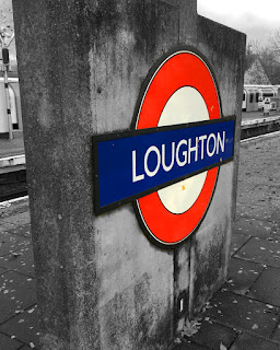
To edit this image I made everything other than the sign black and white. By doing this the main focus of the image stands out more. I think the edited version is better because we are drawn to the station sign rather than what is going on in the background. Making the image black and white also helps with taking away the effect of the leaves as the image appears better without them. Although the train in the background does add effect to the picture I decided it would look better black and white to draw more attention to the sign. As well as making it black and white I increased the saturation of the sing to make it stand out more and appear more vibrant.


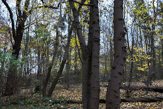
To edit this image I increased the exposure of the image which made it slightly brighter which helps increase the mood and prevent it from looking dark and dull. Also, I increased the saturation of the image which brightens the colour of the leaves on the trees and also brightens the colour of the sky. I think by doing this it has helped with the depth of field as we can see clearly into the back of the image. The edited image appears better because the colours are brighter and the image is less dull. Although the image looks good dull as it was in a forest which people would associate with a darker image I didn't want to spread this stereotypical idea.


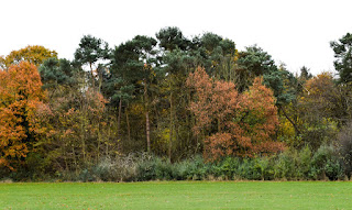
To edit this image I cropped a section of the grass out because it brought more focus to the trees as it was unnecessary space which took away the attraction of the trees. Also, I increased the darkness of the shadows which made the details of the trees stand out more because the shadows appear bold and darker. I increased the saturation too which made the colour of the trees stand out too which also grabs our attention too. By making the sky white it also adds to the effect of eeriness and makes the trees stand out more. 


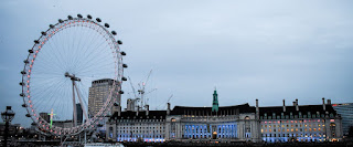
To edit this image I cropped the sky slightly and the bottom too because I wanted to draw attention to the London Eye and the building as these were the main focuses. As well as this I also increased the exposure of the image slightly because it made it look less dull, the sky appears brighter and helps the buildings stand out more. By increasing the saturation of the image makes the lights that are present in the building appear brighter and draws our attention more. I think the edited image appears better because it has a lighter mood and brighter colours.

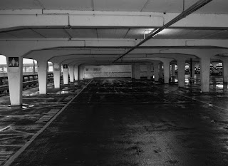
   

To edit this image I cropped it slightly to focus in on a small section of the car park, this added a better effect because we only look into this section rather than looking at other elements that are present in the image. Also, I changed it to black and white and increased the clarity, by doing this it increases the eeriness present in the picture as it appears darker. By making the image black and white the shadows appear blacker which creates a narrower depth of field than the original image as there is more darkness. I wanted to create more darkness in the image because it adds to the horror effect that I wanted to create. 

Joiners Work Diary

Joiners Work Diary

From my research about joiners I was able to create 2 joiners, one of a building which I don't think is my best and one of a person which I prefer out of the two.

This was the first joiner that I created, I went out and took several images of this building and tries to piece it together to form a joiner. In my opinion I dislike this joiner because I couldn't piece it together properly as it doesn't go as well together as I had hoped. To improve this joiner and make it better I should've took smaller images of the building so it would've been easier to piece the images together to make it seem like an actual image. I think this was good for my first attempt at making an joiner but I feel as though I could take another image of a building and try again. Instead of taking zoomed out images of the building I could've zoomed in further and captured smaller sections of the building to make the piecing together stage easier.


I created a second joiner of a person, I used a studio to take several images of this persons body and pieced them together to form a joiner. In my opinion, I think this is my best joiner as although we can see where it has been pieced together and doesn't actually look realistic we can still clearly see where each of her body features are. I think this joiner worked out better then the building joiner because I took smaller sections of her body and pieced them together rather than taking bigger sections. To improve this the only thing I would do is take the pictures on a different background instead of a ripped one. If I was going to progress further with joiners I would take someone face and create a joiner. 

Monday, 23 January 2017

Barbara Kruger Research Post

Barbara Kruger

Context
Barbara Kruger was born in Newark, New Jersey, in 1945. Working for Mademoiselle Magazine, she was quickly promoted to head designer. Later, she worked as a graphic designer, art director, and picture editor in the art departments at House and Garden, Aperture, and other publications. She layers found photographs from existing sources with pithy and aggressive text that involves the viewer in the struggle for power and control that her captions speak to. Much of her text questions the viewer about feminism, classicism, consumerism, and individual autonomy and desire, although her black-and-white images are culled from the mainstream magazines that sell the very ideas she is disputing. 


Photography

This image from Barbara Kruger shows a puppet in the form of a man holding a sign with lines that we would perceive as hypnotising. Having the line "Repeat after me" tells us that we are being hypnotised into thinking certain things and taking orders from people that know their ideas are wrong but they still find a way to transfer them across to the people. The fact that it is in the form of a man shows that the men have all the power and they are giving orders to the women. This can also show that we are being given orders by puppets who are also being hypnotised. Barbara Kruger's feminism can be displayed in this image because she is showing how men are in charge and they have ultimate power.


This image from Barbara Kruger shows someone placing a needle in a haystack, the needle is surrounded by negative and positive words that we experience in every day life. The fact that the needle is being placed in the haystack surrounded by these words shows us that the words are forever going to be lost in the haystack with the needle. You will never be able to find the needle in the haystack. The slogan 'the meaning of life is that it stops' links to the picture because the needle can represent life and the words represent what we go through in life, the fact it is being placed in a haystack where it will never be found again shows that life is stopping. 


This image shows a woman's face, on one side it it normal and unedited but on the other side it looks like we are looking at an x-ray. The fact that the saying "Your body is a battleground" is written across the picture shows that we do things to our body such as getting plastic surgery etc that is changing our body. It can also show that women go through pain to look they way they want to. I think Barbara Kruger is trying to show that we shouldn't go through all this pain to look a certain way we should just embrace the way we look. I think she has used a picture of an x-ray next to a normal woman to show that when women change the way they look it isn't always for the better.

Physical Images Image Bank


I chose this image because I like how elements have been entered into the image to replace her facial features. I also like how this picture shows surrealism and is abstract. Although colour is only present on her face the image is still inviting and bright because of the bright lighting. The dripping effect on her eyes and mouth adds effect to the picture because it is spreading the colour to the rest of her body. I can use ideas from this image in my work because I can add colour to duller parts of the image and add in colourful elements to replace facial features like this image has.


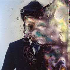
I chose this image because I like how it has been destroyed with water. I like how virtually the whole image has been destroyed but you can still make out what was there before and what the image is supposed to be. The blur of colour is attractive to the eye because we are intrigued to know what the image is showing. Also, I like the inaccuracy of the water, it is not in a certain place and hasn't just blurred out one section of the image. I can use ideas from this in my work by using water to drip or blur the ink from the photo. 


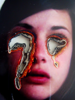
I chose this image because I like how they have used burning to take out her eyes. Although, the burning is not exact, it isn't a clean circle I like this image because it shows imperfections and how our minds instantly replace these burning marks with eyes even though they are not exact replicas of the shape. I think burning has a great effect on an image as it shows how a picture has been destroyed. I can use elements of this image in my work as I can use burning to remove elements of an image or just to destroy the image completely. 


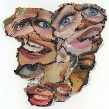
I chose this image because I like how it shows surrealism and is abstract. I like how it forms a collage rather than one image on its own. The fact that the images are not clear and are ripped with uneven edges gives it a bester effect. You can tell that these have been taken from newspapers because of the ripped edges and scratched images. I can use ideas like this in my work by getting difference features like this person has and creating a collage out of them.


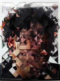
I chose this image because I like the abstractness of the image. The persons face is unclear to us but we are aware of what it is supposed to be. I like how every part of the image has been rotated to make the image look strange and unrealistic. Although we cannot see the face properly we are still able to make out where the features are and which way each part as been rotated. I like this image because it acts as a puzzle for our eyes because we instantly try to piece each section together. I can use ideas from this image in my work by making a similar puzzle with different pictures.

Physical Images


     How does Gilliam’s animations link with Hannah Hoch’s photo-composites?

      They link because they both use other images to manipulate one original image. They both use similar processes because they both involve taking elements from different images and manipulating another image to make it look completely different. Also, the both uses images from magazines and their own original images to produce these photo-composites.


      The image on the left is from Hannah Hoch and the one on the right is from Terry Gilliam. They both use physical methods to create their images by taking images from magazines, newspapers, books etc. The images that thy create are both very different, Hoch's images are obvious which parts have been stuck on and Gilliam's are less obvious.

      How is meaning changed through creating photo-composites?

      The meaning of an image is changed through photo-composites because by adding other elements of a different image it might not relate to the image at all. It has been taken out of it's original context and put into a different environment. 

      Photo manipulation involves transforming or altering a photograph using various methods and techniques to achieve desired results.

Whilst this is usually done using software,  the physical adaptation of images is practised through e.g.
–Tearing,
–painting
–scratching,

–etc.


Monday, 16 January 2017

George Logan Research Post

George Longan

Context

Born in Bellshill, near Glasgow, Scotland, George studied at Blackpool College of Photography before moving to London where he is currently based. George is a muti-faceted talent, equally at home on location or in the studio, working with people, animals, locations or still life. George's work receives critical acclaim both in the UK and Internationally. He has three current travelling solo exhibitions in the UK and is a regular exhibitor at many of London's galleries. His work was also shown at the Shanghai International Photography Exhibition in China. He approaches his work with imagination, energy and lots of enthusiasm. His work is distinctive and unique. 

Photography


In this image we can see a wedding in a church and the bottom half of a groom and the bride, their tops halves have been replaced by a phone which has and image of two sports figures. I think the deeper meaning of this image is that sports people share the same love for each other because they have a close relationship and spend a lot of time together. This image is related to sport relationship and maybe the love that team mates share as they have to play together and co-operate well to be able to play the game well. I like the idea of using a phone to  place another image on top of the original image.


In this image we can see a group of pigs standing in the middle of the street. We can tell this image has been manipulated because we wouldn't normally see these type of animals in the middle of a normal street. I like this image because it gives an interpretation of imagination. I think this image could also be expressing the feelings of people who believe that caged animals in zoos are wrong. These pigs wouldn't be able to survive in this environment, he may be showing us that this environment is similar to the zoo environment. The fact that the sky is dull and dark gives a depressing effect on the image which tells us this isn't a happy image and it is giving us a deep message.


In this image we can see a normal countryside village but what really stands out is the fact that we can see an elephant walking through. Like the image before I think Logan is trying to show a view that animals shouldn't be caged in a zoo they should be allowed to walk free. The fact that we can't see the elephants face shows us that it has no identity, this could be linked to them living in a zoo as they don't have no real identity or life they just belong behind bars. I like this image because it is very obvious that it has been manipulated because we wouldn't see this in real life.

Composite Image Making Image Bank


I chose this image because I like how it has a deeper meaning that just that his upper body has been changed and replaced with smoke. The deeper meaning of this image could be the fact that this is how some people feel underneath and in their head but they fail to show it. I like that the shape of the head can still be seen if you look closely. Also, the fact that they have used white smoke gives the image a great effect because the rest of the image is dull and dark which makes the smoke stand out more. I can use this in my work by replacing something in an image with something completely but make it still look realistic. 


I chose this image because I like that just by removing the man from the image makes it a lot better. Also the way they have changed the lighting makes the image look brighter and more attractive than the original image which is much duller and boring. The fact that they have also taken away the shadow of the mountain in the background   makes the image better too because it reduces the darkness in the image and makes it appear happier and brighter. I can use this in my images because I can take someone completely out of an image to make it better.


I chose this image because I like that it almost tells a story of this one girl. When you first look at the image you think the girl in the right corner is taking a picture of a girl in the mirror but it is the same girl when you look closely. The way she has incorporated herself into the image more than once is clever because at first look we think we are looking at different people. The section of the image which interests me the most is the mirror section which shows her wearing one outfit in the mirror but looking into the mirror she is wearing a different outfit. I can incorporate this into my image by using something similar by using a mirror. 


I chose this image because I like how we can see the motion that the woman has taken and the fact that the background has been made duller so we can focus fully on the woman's movements. Although this image has been manipulated I like that it looks realistic as we can't really tell it has been changed. I can use ideas like this in my work because I can manipulate a photo by following someones movements and showing them in one image.


I chose this image because I like how it has been manipulated where we see something as it is but in a different way. In this image we see a hand but it is acting as a statue or a wall. I think by adding the bird onto the hand gives a good effect because it acts more like a statue and a wall instead of us thinking of it as a hand. I can use ideas like this in my work because I can manipulate images by inserting elements that don't actually belong there but look like they belong.

Composite Image Making

Composite image making is how an image is made using several other images which have been manipulated to form the image. I think composite image making is right for magazines in some circumstances because the editor of the magazine has to make the cover look approachable so people will buy it. However, if it is being used to change how someone looks completely to show how people are supposed to look I think this is wrong as it gives false hope to people who are viewing this image. It shouldn't be used if it is set up to lie to someone, for example if it is used on the news this isn't right because people want to see the real things that are happening rather than a made up image that may extend the truth of what is actually happening.

We use photoshop to manipulate the captured image to an extent determined by the artist/retoucher. In some senses photoshop is used in a reasonable way to colour balance, contrast, cropping. In other senses such as retouching and airbrushing to an extent is okay but if is completely changing the look of someone then it is wrong. It is completely wrong to composition a person because it is changing the person completely to look like a different person.


In this case I think composite imaging is wrong as they have changes the appearance of his skin which can be seen as controversial as they are playing with his race. By making him darker they are saying that he looks more guilty. This can be seen as racist as they are showing that people with darker skin look more guilty. It would be the same if they had made his skin lighter and said he looks more approachable just because he has lighter skin. Composite imaging should absolutely not be used in this way at all. 


In this case I think composite imaging is acceptable because it has just been used to create a nice image. There is nothing controversial about this image, it doesn't offend anyone in anyway. This picture may just be being used for an advert in a magazine which we all know composite imaging is used to make the adept look more inciting so we take a second look. If composite imaging was used in this case it is acceptable because nobody takes office to it.


This is a composite image I made using Photoshop. To create this image I used two images, on of the River Thames and a rubber duck. It shows three ducks on the Thames to appear as if they are actually floating which we obviously know isn't real. In this case we can see that composite imaging has been used so we learn to accept it. If this was being used to convince someone that this had really happened it would be wrong because it is a lie.

Saturday, 14 January 2017

Connecting Essay 4

Connecting Essay

Thomas Ruff


In this picture we can see a portrait picture of a woman on a white background. The woman has no expression on her face and her clothes are dull and boring. This photographer has a series of photographs like this, I think he is expressing different people, how different people look or dress. I like how he expresses each person but I think he could add more colour and brightness to these photos because it will draw people's attention in more to his work. Personally, this isn't one of my favourite photographers because I find it very boring as I struggle to find a real meaning behind the images, I understand why he has taken them but there isn't a real deep meaning. I think his images are significant in the photography world because everyone else's portrait images are bright and stand out where as his do not really grab our attention.


In this picture we can see a portrait picture of a girl on a pink background. The girl doesn't really have an expression but she seems happier than the woman we can see before in Thomas Ruff's image. Her clothes also stand out because of the colour difference from the background. I think this portrait image stands out better against Thomas Ruff's image because it has a brighter background and she is wearing a brighter coloured jumper whereas the other woman is wearing very dull colours. However, the two images are similar because they are just normal portraiture images with no real expression and nothing else going on in the images.

Connecting Essay 3

Connecting Essay 4

Henri Cartier-Bresson


In this image we are looking at a street, we can see a staircase, at the bottom of the staircase we see a slightly blurry person on a bike. We know that Cartier-Bresson wanted to capture real life which relates to this image because he has taken photos of the action that happens on this street. I think he wanted to capture the real shadows and patterns that are present in real life that we can see in this image. He has incorporated the staircase to add a zigzag effect to them, the stairs shows the difference in height between the cyclist and the photographer. Henri Cartier-Bresson uses the decisive moment in his pictures, this is shown because he had to pick the right moment to be able to get the person on the bike in the shot at the right time. He was able to take the picture at the right time because if the biker moves forward or backward he with be out of shot or blocked by the staircase railings. 


In this image we can see a busker and in the background a bus going past. This image shows main aspects of London by showing a red bus and a busker which you see a lot around London. It links to Henri Cartier-Bresson's decisive moment because I had to take this at the right moment to get the bus in the background. If I had taken it at a different time the bus would've been in a different position and wouldn't have filled the whole background. I wanted a motion blur because I felt like this would have a bigger impact on the image. Similar to Cartier-Bresson's image everything that is moving quickly in our images are blurred which gives a better effect to the image.