On the topic of shape I took several images, some of them turned out the way that I wanted but some of them didn't work the way that I wanted them too.

I think this is one of my best images because the shapes are clear in the image. The way the darker colours on the palette are situated at the front show that the image almost gets lighter as you look into it. I like this image because it doesn't just represent shape but it also incorporates myself in the image as it is my palette. I like that I can incorporate things of my own in my work, this is almost like the shapes that fit together to show my personality and features. To edit this image I think I should saturate the colours to make them stand out a lot more.

I think this is also one of my better images because the shape of the keys is shown well as they appear 2D instead of 3D. Also the way that the beginning of the image isn't in focus and neither is the background but the middle part is in focus, this adds great effect because it makes you focus on the keys more in the middle where they are more important. To edit this image I think I should sharpen it to make the keys more visible and the unfocused ones to stand out a tiny bit more. Also, in this image I think I should've zoomed out a bit more and incorporated more of the keys in my work.

I think this is one of my not so good images because the shape is visible but not in the way I would've liked it to be. I wanted to try and capture the shape of the plug socket because it is 2D but the angle of the image doesn't do it any justice. If the angle of this image was better and more central then it would've turned out as I expected. Also, the lighting isn't that good either because there is a shadow going across the middle of the socket so maybe if I had used a flash this would not have happened.
Progression
To progress my images I put them in Photoshop and edited them the way that I thought would progress them well.


To edit this image I made it black and white and sharpened the image. By making the image black and white colours that we present in the original image wouldn't be distracting and we would be able to focus just on the shape. By sharpening the image we can focus in more on the shape of the logo because it becomes more bolder. I think the edited version of the image is better than the original because everything becomes more clear and the shape can be focused on more. To progress this image more I could've zoomed in more on the logo.

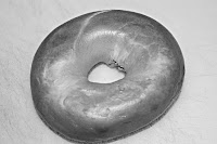
To edit this image I made it black and white and sharpened it. By making it black and white the bagel is the same colour so the shape is more clearer and by sharpening it the shape also becomes clearer as the edges become more sharper. The edited version of the image is better because shape is clearer and instead of focusing on the colour which is mire existent in the original image we can focus more on the shape in the edited image.

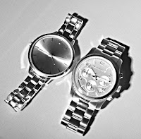
To edit this image I made it black and white, cropped the image and then sharpened it. By making it black and white the colours are not visible so it doesn't take out attention away from the shape, by cropping the image the excess space that is in the original image doesn't exist in the edited one and also by sharpening the image the shape of the faces stand out more so we can focus more on their shape. To further progress this image I think I should've gotten close to the watches so that I wouldn't have to to crop the image.

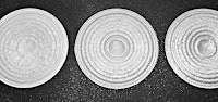
To edit this image I made it black and white, sharpened and cropped it. By making the image black and white the colours of the various powers cannot be established so we refrain from focusing on the colours because in black and white they all look the same. By sharpening it we can see the shape more clearly as the edges appear more smooth. By cropping the image again we can focus in more on the shapes rather than anything else. I think the edited version of this image is better because there are no distractions from shape in the edited one. To progress this image more I could've maybe taken pictures of the powders individually.

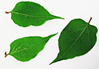
To edit this image I made the image brighter, sharpened and cropped the image. By making the image brighter it is more clearer because in the original image it is quite dull. By sharpening the image the shape of the leaf becomes more clearer and by cropping the image we focus on the leaves rather than the excess white space. The edited version of the image is better because it is clearer and draws us in more. To progress this image more I could make it black and white so the colours don't take away the effect of the shape.
Next time if I get a chance to take pictures relating to this topic I will progress the images further to make them better.
You have some good progression here a strong work diary with analysis and clear refinement of your ideas.
ReplyDeleteNote I think you have some issues with cropping... when composing allow space so you are not cutting out the visual elements from the frame.
ReplyDelete